Elements of persuasive product pages: 2026 guide
Unlock the secrets to boosting sales with the essential elements of persuasive product pages. Learn how to optimize for conversion today!

Elements of persuasive product pages: 2026 guide

TL;DR:
- A persuasive product page relies on structured images, benefit-driven copy, visible social proof, transparent pricing, and an effective CTA. Optimizing these elements significantly boosts conversion rates by addressing buyer concerns and guiding them smoothly to purchase. Prioritize simple, low-cost adjustments like sticky mobile bars, benefit-focused descriptions, and honest pricing to maximize results efficiently.
A persuasive product page is defined by five core components: a structured image gallery, benefit-focused copy, visible social proof, transparent pricing, and a high-contrast call to action. Research by the Baymard Institute shows that 20% of purchase abandonments stem directly from insufficient product information, and fixing these UX gaps yields an average 35.26% conversion increase. NNGroup data confirms that users spend 65% of their time on product page images, making visuals the single biggest lever you control. The elements of persuasive product pages are not optional extras. They are the architecture of every sale you make.
1. What makes a structured image gallery so persuasive?
Visual appearance is the primary purchase factor for 93% of shoppers, which makes your image gallery the most powerful conversion tool on the page. Photography does not just show the product. It answers the buyer’s unspoken question: “Will this fit my life?”

Sequence matters as much as quality. Lead with a lifestyle hero shot that places the product in context, follow with detail and texture close-ups, then include a scale reference image, and close with user-generated content (UGC) where available. Structured image galleries raise add-to-cart rates by 20 to 30% compared to single-image listings. That is not a marginal gain. It is the difference between a page that sells and one that browsers scroll past.
On mobile, swipe interaction and pinch-to-zoom are non-negotiable. A gallery that requires tapping through tiny thumbnails loses buyers before they reach the CTA.
- Hero shot: lifestyle context, natural lighting, product in use
- Detail shots: texture, stitching, ports, materials at close range
- Scale reference: product next to a hand, a desk, or a common object
- UGC: real customer photos build authenticity no studio shot can replicate
Pro Tip: Test image order by product category. For fashion, lead with lifestyle. For electronics, lead with the product face-on. For home goods, lead with the product styled in a room. Category context changes what buyers need to see first.
2. How to write benefit-focused copy that actually sells
Benefit-led product copy drives 15 to 25% higher add-to-cart rates compared to feature-only descriptions. The distinction is simple: a feature is what the product has; a benefit is what the buyer gains. “400-thread-count cotton” is a feature. “Stays cool through summer nights” is a benefit.
Structure your copy in three layers. Open with a single benefit statement that addresses the buyer’s primary motivation. Follow with four to six bullet points covering the key benefits, each written in plain language. Then expand with a short narrative paragraph that adds context, addresses the top one or two purchase objections, and weaves in your target keywords naturally. For persuasive product copy that also ranks on Google, keyword integration must feel invisible, not forced.
Scannability is not a design preference. It is a conversion requirement. Most buyers do not read product pages. They scan for the answer to their specific concern. If that answer is buried in a wall of text, they leave.
Include a micro FAQ directly on the page. Two or three short questions such as “Does this fit a standard UK plug socket?” or “Is this suitable for sensitive skin?” pre-empt the objections that kill sales silently. Writing effective bullet points for product pages is a craft in itself, and the format alone can lift engagement before a single word changes.
Pro Tip: Read your description aloud. If it sounds like a spec sheet, rewrite it. If it sounds like you are explaining the product to a friend who asked “why should I buy this?”, you are close.
3. What role does social proof play in conversion?
Products with five or more reviews convert 270% better than those with none. For higher-priced items, that lift is even greater because the perceived risk is higher and buyers need more reassurance before committing.
Place your star rating and review count directly below the product title, above the fold. Buyers look there instinctively. A rating buried at the bottom of the page does not function as social proof. It functions as an afterthought.
Photo and video reviews carry more weight than text alone. A customer photo showing the product in a real home or on a real person answers visual questions that studio photography cannot. Encourage these actively through post-purchase emails, and respond publicly to negative reviews. A handled complaint signals that you stand behind your product, which builds more trust than a perfect five-star average.
Real-time nudges such as “14 people viewing this right now” increase perceived product quality, but fake scarcity signals erode trust quickly. Use them only when the data is genuine.
Filter and sort options on your review section improve UX and give buyers control. Letting shoppers filter by “with photos” or “verified purchase” reduces friction and increases the credibility of every review displayed.
4. Why pricing transparency is a conversion multiplier
67% of e-commerce sites hide shipping or tax information until checkout. That single practice drives 39% of cart abandonments. Buyers do not abandon because the price is too high. They abandon because the final price surprised them.
Display the full landed cost on the product page. Show VAT-inclusive pricing, estimated shipping cost, and an estimated delivery date. “Arrives by Thursday 12 June” converts better than “3 to 5 business days” because it is concrete and personal. Vague shipping windows create doubt. Specific dates create confidence.
| Trust signal | Placement | Impact |
|---|---|---|
| Security badge (SSL, payment icons) | Near add-to-cart button | Reduces payment anxiety |
| Return and exchange policy | Below CTA, visible without scrolling | Reduces purchase risk perception |
| Estimated delivery date | Adjacent to price or CTA | Increases purchase urgency |
| Discount transparency (original vs. sale price) | Next to price display | Builds credibility, EU Omnibus compliant |
| Warranty or guarantee statement | Near CTA | Reduces post-purchase regret concern |
EU Omnibus Directive compliance requires that displayed discounts reference the lowest price from the previous 30 days. This is not just a legal obligation. It is a trust signal. Buyers who see a credible discount history are more likely to act on the offer.
Returns and delivery information placed near the CTA reduce abandonment significantly. Do not make buyers hunt for your returns policy. Put it where the decision happens.
Pro Tip: On mobile, use a sticky bar at the bottom of the screen that shows the price, delivery date, and add-to-cart button simultaneously. Buyers should never have to scroll back up to check the price before tapping buy.
5. How CTA design and placement maximise conversions
Personalised CTA copy converts 42% more visitors than generic alternatives. “Add to Cart” is functional. “Get Yours Today,” “Add to Bag,” or “Start Your Trial” are category-fitted and psychologically specific. Test the wording against your product type and audience before settling on a default.
Button size on mobile must meet a minimum of 48px height for touch targets. Anything smaller creates tap errors and frustration, both of which kill conversions. High visual contrast between the CTA button and the surrounding page is not a design preference. It is a functional requirement for the button to register as the primary action.
Sticky add-to-cart bars on mobile raise add-to-cart rates by 12 to 25%. As buyers scroll through images and copy, the purchase option stays visible without requiring them to scroll back. This removes one of the most common friction points on long product pages.
Place trust signals immediately adjacent to the CTA. A security badge, a one-line returns policy, and a delivery date next to the button form a reassurance cluster. Buyers make the final decision in that zone. Everything they need to feel confident should be within eye range of the button they are about to tap.
- CTA copy: test category-specific wording against your default
- Button size: minimum 48px height for mobile touch targets
- Contrast: CTA must stand out visually from every surrounding element
- Sticky bar: keep CTA visible as buyers scroll on mobile
- Trust cluster: security badge, returns policy, and delivery date adjacent to CTA
Pro Tip: Swap “Add to Cart” for a verb that matches your product’s emotional promise. A fitness supplement page that uses “Start Your Transformation” will outperform one that uses the default. The copy should feel like the first step, not a transaction.
Key takeaways
Persuasive product pages require structured imagery, benefit-led copy, visible social proof, transparent pricing, and a well-placed CTA to convert browsers into buyers consistently.
| Point | Details |
|---|---|
| Images drive decisions | Structured galleries with lifestyle, detail, scale, and UGC shots raise add-to-cart rates by 20 to 30%. |
| Benefits outperform features | Benefit-led copy yields 15 to 25% higher add-to-cart rates than spec-only descriptions. |
| Social proof above the fold | Star ratings and review counts placed near the product title convert significantly better than those buried below. |
| Transparent pricing reduces abandonment | Displaying full costs and delivery dates on the product page removes the surprise fees that cause 39% of cart abandonments. |
| CTA placement and copy matter | Personalised CTA wording and sticky mobile bars can lift conversions by 12 to 42% with minimal development effort. |
Where to focus first: a practical prioritisation view
The most common mistake I see e-commerce entrepreneurs make is treating product page optimisation as a full redesign project. It is not. It is a triage exercise, and the impact-vs-effort matrix is the most useful tool I have found for cutting through the noise.
Start with the three changes that cost almost nothing and return the most. Add a sticky add-to-cart bar on mobile. Display your delivery date and returns policy next to the CTA. Rewrite your opening product description as a benefit statement rather than a spec list. These three changes alone address the most common reasons buyers leave without purchasing.
The temptation to test five things at once is real, but it destroys your ability to learn. Run one change at a time, give it enough traffic to reach statistical significance, and then move to the next. Incremental improvements compound. A 5% lift from better CTA copy, followed by a 7% lift from improved trust signals, followed by a 10% lift from a restructured image gallery adds up to a meaningfully different business over six months.
Mobile-first is not a trend. Mobile product pages that fail to show the product name, price, and CTA above the fold lose buyers before they have read a single word of copy. Check your pages on a real device, not just a browser simulator. The gap between what looks good in a desktop preview and what a buyer actually experiences on a phone is often where conversions disappear.
The essentials-first approach from Shopify’s own product experts reinforces this. Clear CTAs, effective imagery, concise benefit copy, and visible social proof outperform any clever design trick. Get the fundamentals right before you invest in personalisation engines or advanced A/B testing platforms.
— Koen
Build persuasive product pages at scale with Ecom-eye
Writing benefit-led copy, sourcing structured image sets, and optimising every product page manually is not a realistic strategy when you are managing hundreds of SKUs. Ecom-eye automates the entire process.
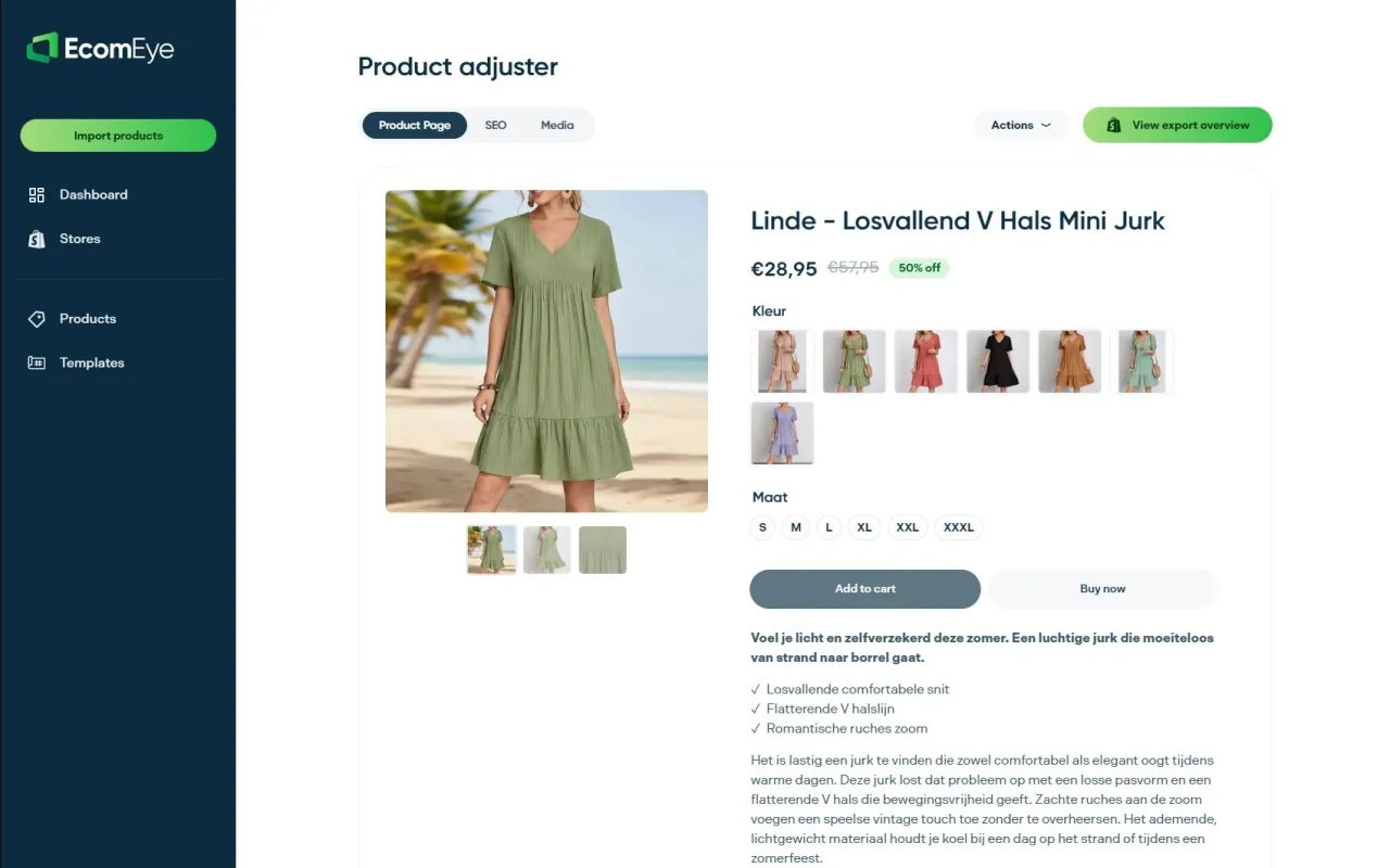
With Ecom-eye’s Bulk AI Product Lister, you import products from AliExpress or competitor links and receive SEO-optimised titles, benefit-focused descriptions, and high-quality AI product images in minutes. Every page is copyright-safe, Google Merchant-ready, and exportable to Shopify in one click. No rewriting. No duplicate content risk. No manual work. If you are building a Shopify dropshipping store and want pages that convert from day one, Ecom-eye removes the bottleneck between sourcing and selling.
FAQ
What are the most important elements of a persuasive product page?
The five core elements are a structured image gallery, benefit-focused copy, visible social proof, transparent pricing, and a high-contrast CTA. Research shows that correcting these elements can increase conversions by over 35%.
How many product images should a product page have?
Most high-converting product pages include five to eight images covering a lifestyle hero shot, detail close-ups, a scale reference, and at least one UGC photo. Structured galleries raise add-to-cart rates by 20 to 30%.
Why does pricing transparency affect cart abandonment?
67% of e-commerce sites hide shipping or tax costs until checkout, which causes buyers to abandon when the final price exceeds their expectation. Displaying full costs and a specific delivery date on the product page removes this friction.
How should I write a product description that converts?
Open with a benefit statement, follow with four to six benefit-focused bullet points, and close with a short narrative that addresses the top purchase objections. Benefit-led copy outperforms feature-only descriptions by 15 to 25% on add-to-cart rates.
What CTA copy works best for product pages?
Category-specific wording such as “Get Yours Today” or “Add to Bag” outperforms generic “Add to Cart” copy. Personalised CTA wording converts up to 42% more visitors, and testing two or three variants against your default is the fastest way to find what works for your audience.
Ready to boost your product pages?
Generate high-converting, SEO-optimized product pages in bulk using AI automation used by e-commerce experts.
No credit card required


