Content ideas for product pages that actually convert
Boost your sales with effective content ideas for product pages. Discover key strategies that drive conversions and enhance buyer engagement.

Content ideas for product pages that actually convert

The fastest way to lift conversions on your product pages is not a redesign. It is better content. Specifically: a benefit-led headline, a layered description that handles objections before they form, star ratings anchored near the title, and delivery information sitting right next to the “Add to Basket” button. Those four changes alone separate the median UK ecommerce store from the top quartile.
Here is what high-performing product pages consistently include:
- A transformation headline — what the buyer’s life looks like after purchase, not a product name followed by a spec
- Layered copy — a two-sentence hook, then scannable benefit bullets, then an objection-handling paragraph
- Social proof above the fold — star rating and review count linked to the reviews section, positioned directly under the product title
- Multimedia assets — at minimum five images (lifestyle, white background, detail, scale, UGC) plus a short video
- Delivery and returns near the CTA — not in the footer, not in a separate policy page, right there beside the button
- Urgency signals — low-stock alerts or “X sold in the last 24 hours,” but only when the data is genuine
- A sticky “Add to Basket” bar on mobile — so the CTA is never more than a thumb-tap away
Every item on that list is a content decision, not a development task. You can implement most of them this week.
Table of Contents
- What makes a product page actually convert?
- Creative content ideas that set UK product pages apart
- What do successful UK ecommerce product pages look like?
- How to write SEO-optimised product page content that sells
- Ecom-eye generates product page content that ranks and converts
- FAQ
- Key takeaways
What makes a product page actually convert?
High-converting product pages share a specific architecture. Think of the page in three zones: conviction, justification, and commitment.
Conviction is everything above the fold. The shopper arrives and within three seconds needs to know: what is this, why should I care, and can I trust this store? Your headline does the first job. A one-line value proposition does the second. Star ratings anchored prominently near the product title handle the third more effectively than a large review count buried below the fold.
Justification is the middle of the page. This is where your description, images, video, and social proof live. Most stores treat this zone as a dumping ground for spec sheets. The stores that convert treat it as a structured argument for why this product is the right choice. Lead with outcomes, not attributes.
Commitment is the purchase action area. Every element here should reduce friction. Transparent delivery and returns information placed near the purchase CTA lifts conversion by 6–11%, while burying those details in the footer is one of the most common and costly mistakes UK stores make.
Visual hierarchy and mobile-first layout
Mobile accounts for a majority of product page traffic across Shopify stores. That means your mobile layout is your product page, not a secondary concern. Lead the image carousel with a lifestyle shot, not a flat white-background image. Lifestyle images first in a mobile carousel increase add-to-cart rates by 15–25%. Keep variant selectors (colour, size) reachable with one thumb in the lower third of the screen. Replace dropdown menus with button selectors wherever possible — dropdowns are a mobile conversion killer.
Sticky “Add to Basket” bars on mobile consistently increase add-to-cart rates by 8–14% in Shopify stores running Dawn 3.x. It is one of the highest-return, lowest-effort changes available to any Shopify operator.
Benefit-oriented headlines
Your product title is not a catalogue entry. The pattern that works: product name plus a benefit hook that answers “why this one.” “Merino Wool Crewneck — Temperature-Regulating, Machine-Washable, Built to Last a Decade” outperforms “Merino Wool Crewneck” every time. Leading with transformation and outcome in headlines creates stronger shopper engagement than opening with specs.
Pro Tip: Write your headline last. Draft the full description first, identify the single most compelling benefit that emerges, and use that as your headline hook. It is almost always more specific than what you would have written upfront.
Creative content ideas that set UK product pages apart
Generic advice says “add more images” and “write better descriptions.” The stores actually pulling ahead in 2026 are doing something more specific.
1. Mine your support tickets for copy gold
Your customer service inbox is the most underused copywriting resource you have. The exact phrases shoppers use when they are confused, worried, or frustrated are the phrases your product page should answer. If three people this month asked “will this fit a standard UK plug socket?”, that question belongs on your product page, answered clearly, before the shopper has to ask. Using customer language from support tickets and reviews dismantles objections before they become purchase barriers. This is the highest-leverage copywriting research available to any operator.
2. Use UGC photos alongside professional imagery
Professional product photography builds credibility. Customer photos build trust. They are not the same thing. A shopper seeing a real person’s photo of the product in their actual home or on their actual body resolves doubts that a studio shot cannot. Platforms like Yotpo and Okendo offer UGC gallery modules that display customer photos inline with product images. Stores using this feature report higher conversion rates on pages where UGC is visible above the fold.

3. Embed a 60–90 second explainer video mid-page
Not a brand video. Not a lifestyle montage. A video that shows the product being used, demonstrating the specific feature or benefit that is hardest to convey in text. Embedding 60–90 second product explainer videos mid-page typically lifts conversion rates by 8–15% in Shopify verticals. For fitness equipment, kitchen tools, or anything with moving parts, this is close to mandatory.

4. Add 360-degree images for high-consideration products
For products where the shopper needs to understand the full form — furniture, footwear, bags, electronics — a 360-degree image viewer removes the “I wish I could see the back of it” hesitation that kills conversions. Several Shopify apps support this natively, and the implementation cost is typically a single afternoon.
5. Personalise content blocks by customer segment
Returning customers do not need the same page as first-time visitors. Tools like Rebuy Engine on Shopify allow you to show different content blocks based on whether someone is a new visitor, a returning customer, or a loyalty member. A returning customer might see “Welcome back — here is what pairs well with your last order” instead of a generic product description. This is no longer an enterprise-only capability.
6. Use “Frequently Bought Together” modules built on real purchase data
Static “You might also like” carousels built from manual curation consistently underperform. Personalised “Frequently Bought Together” modules based on real purchase co-occurrence data increase average order value by 12–18%. Place the module below the “Add to Basket” button, not in the footer. The placement matters as much as the logic behind it.
7. Write a pinned review that addresses the top objection
Do not leave your review section to chance. Identify the most common pre-purchase concern (sizing, durability, compatibility) and surface a specific customer review that addresses it, pinned at the top of your review feed. A shopper who sees “I usually size up in knitwear but this fit true to size” next to the size guide is far less likely to abandon over a sizing worry.
8. Add a product Q&A section
A curated Q&A block does two things simultaneously: it reduces support enquiries and captures long-tail search queries that show strong buying intent. If your platform supports it (Shopify via Judge.me or Yotpo, WooCommerce via WP Product Review), a Q&A section is one of the most underused and highly effective features for considered purchases. For niche categories, writing compelling product descriptions that speak directly to a specific community’s concerns, as explored in gothic product descriptions, shows how targeted copy dramatically outperforms generic text.
9. Show review recency, not just volume
A 4.8-star rating means considerably less if the most recent review is fourteen months old. Display review dates prominently. If your recency is lagging, run a post-purchase review request sequence through Klaviyo or Attentive immediately. Fresh reviews signal an active, trustworthy store.
10. Use inventory urgency signals honestly
“Only 3 left in stock” and “47 people viewed this today” work. They work because they are true signals of demand. Deploy them only when the data is real. False urgency is detectable, and once a shopper catches it, the trust damage extends beyond that single page.
Pro Tip: Pull your one-star and two-star reviews and read them as a brief. Every complaint is a conversion objection your page is currently failing to handle. Rewrite your description to pre-empt the top three.
What do successful UK ecommerce product pages look like?
The best UK product pages share a set of structural decisions that are worth examining in detail.
The three-layer description structure
Every high-converting description follows the same architecture, regardless of category:
- The hook (2–3 sentences): What the product does for the customer, not what it is. Lead with the outcome. “You will stop sweating through your shirt in the first hour of a summer meeting” outperforms “Our fabric features moisture-wicking technology” every time.
- The feature block (bulleted): Specs, materials, dimensions, care instructions. Scannable and honest. Include numbers wherever possible.
- The objection handler (1–2 sentences): Address the most common pre-purchase concern directly. For a UK clothing retailer, this might be: “If it does not fit the way you expected, returns are free and take 90 seconds to initiate.”
The image set that removes doubt
Five images is the minimum. Eight is better. The sequence matters on mobile:
| Frame | Content | Purpose |
|---|---|---|
| 1 | Lifestyle shot (product in use, real environment) | Establishes context and aspiration |
| 2 | Clean product shot on neutral background | Reference and comparison |
| 3 | Detail or texture close-up | Resolves material quality questions |
| 4 | Scale shot (next to recognisable object or on model with measurements) | Eliminates size uncertainty |
| 5 | UGC or social proof shot | Builds trust through real-world evidence |
| 6–8 | Additional angles, packaging, what’s in the box | Handles remaining visual questions |
For clothing, include close-ups of fabric and stitching. For home goods, include a room scene showing scale. For trade products, show packaging and box contents. These are not optional extras — they are the visual equivalent of answering the questions a shop assistant would handle in person.
Trust signals placed where they work
Payment security badges and return policy icons placed near the “Add to Basket” button convert. The same badges in the footer are essentially invisible. UK shoppers specifically look for clear delivery timelines (cost, estimated arrival, dispatch cut-off) before committing. If you reveal delivery costs only at checkout, you are creating the conditions for abandonment.
Pro Tip: Run a five-second test on your product page. Show it to someone unfamiliar with your store for five seconds, then ask: what does this product do, how much does it cost, and when will it arrive? If they cannot answer all three, your above-the-fold content needs work.
For a deeper look at what the most persuasive product pages have in common, the elements of persuasive product pages guide covers the full architecture in detail.
How to write SEO-optimised product page content that sells
SEO and conversion are not competing priorities on a product page. The same practices that help Google understand your page also help shoppers decide to buy.
Use customer language, not manufacturer language
Manufacturer copy is written for catalogues. Shoppers search in their own words: “waterproof walking boots wide fit,” “non-stick pan dishwasher safe,” “desk lamp USB-C charging.” Your product page should mirror that language naturally, because it reflects real search intent. Using a “customer’s dictionary” mined from actual shopper language in support tickets and reviews creates copy that directly dismantles objections and improves both trust and rankings.
Technical SEO specifics for product pages
- Unique titles: Every product page needs a distinct title tag. Copying manufacturer titles or using the same template across hundreds of pages creates duplicate content problems that suppress rankings across your entire catalogue.
- Schema markup: Product schema (name, price, availability, review aggregate) helps Google surface your pages in rich results. On Shopify, most themes handle this automatically; on WooCommerce, the Yoast WooCommerce SEO plugin adds it cleanly.
- Primary keyword in the first sentence: Include your main keyword naturally in the opening line of the description, once in a bullet, and secondary long-tail variants (materials, use cases, dimensions) throughout. This is the approach that gets product pages surfaced in Google’s AI Overviews.
- Out-of-stock pages: Keep out-of-stock product pages live while marking stock status clearly and offering restock notifications. Removing them destroys accumulated SEO equity and eliminates a lead-capture opportunity.
- Image alt text: Write accurate, natural descriptions (“Black insulated travel mug 500ml with screw lid”) rather than keyword-stuffed strings. It supports accessibility and search relevance simultaneously.
Content freshness and quarterly audits
A product page is not a “publish and forget” asset. Build a quarterly audit into your operating calendar. Each audit should cover: image quality (are seasonal lifestyle shots still relevant?), copy freshness (do review mentions match the current spec?), pricing accuracy, mobile rendering on the latest iOS and Android versions, and page speed against your competitive set.
Top-quartile Shopify brands achieve mobile product page conversion rates above 5.4%, compared to the median of 2.1%, by focusing on page architecture rather than paid advertising. That gap is almost entirely a content and structure problem, not a traffic problem.
Pro Tip: Track one primary KPI per product page optimisation test — add-to-basket rate is usually the right one. Run one test per element per month. Simultaneous tests on the same page produce unreadable results.
For stores running on Shopify, the Shopify product page layout guide covers the technical structure decisions that affect both ranking and conversion in detail.
Ecom-eye generates product page content that ranks and converts
Writing unique, SEO-ready product descriptions for hundreds of products is where most Shopify dropshipping stores stall. The manual approach — rewriting each description, sourcing images, translating for new markets — takes weeks and still carries copyright risk if the source content is not properly transformed.
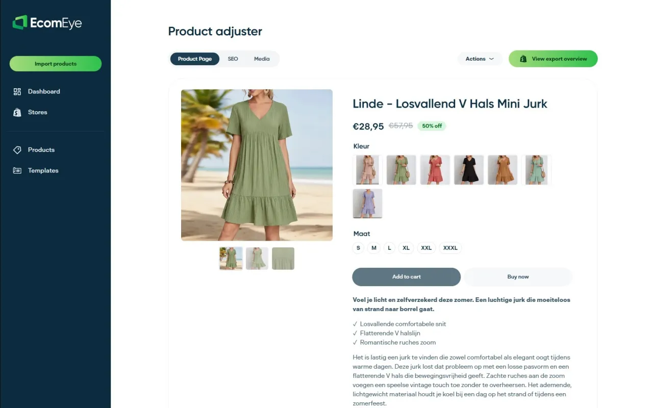
Ecom-eye solves this at scale. Import products in bulk from AliExpress or competitor links, and Ecom-eye automatically generates optimised titles, clean descriptions, SEO-ready content, high-quality AI product images, and multi-language pages. Everything exports directly to Shopify in one click. No rewriting. No copyright risk. No manual work. For UK dropshippers who need to launch or refresh a large catalogue without the overhead of a content agency, it is the most direct route from product import to live, ranking page.
If your product pages are currently built on copied manufacturer copy or scraped competitor content, every day they stay live is a day Google is actively suppressing your catalogue. Start generating unique product pages with Ecom-eye today and get your catalogue ranking-ready without the manual grind.
FAQ
What should be on a product page?
Every product page needs a benefit-led headline, layered description (hook, feature bullets, objection handler), at least five images, star ratings near the title, and delivery and returns information next to the “Add to Basket” button. Trust signals and a clear CTA complete the essentials.
What are some unique content ideas for product pages?
Mining support tickets for customer language, embedding 60–90 second explainer videos, adding a pinned review that addresses the top purchase objection, and using “Frequently Bought Together” modules built on real purchase data are among the highest-impact ideas that most UK stores have not yet implemented.
How do I write a product description that actually sells?
Structure it in three layers: a two-to-three sentence hook leading with the outcome, a scannable bullet block covering specs and benefits, and a one-to-two sentence objection handler addressing the most common pre-purchase concern. Use the exact language your customers use in reviews and support tickets.
How does Ecom-eye help with product page content?
Ecom-eye generates copyright-safe, SEO-optimised product titles, descriptions, and AI product images in bulk from AliExpress or competitor links, then exports everything directly to Shopify. It removes the manual rewriting bottleneck for dropshipping stores managing large catalogues.
Should I keep out-of-stock product pages live?
Yes. Removing out-of-stock pages destroys accumulated SEO equity. Mark the stock status clearly, offer a restock notification option, and keep the page live to preserve rankings and capture leads from shoppers who want the product when it returns.
Key takeaways
The single most effective way to improve product page conversions is to structure content around the shopper’s decision process: conviction above the fold, justification in the middle, and friction-free commitment at the CTA.
| Point | Details |
|---|---|
| Lead with outcomes, not specs | Benefit-led headlines and hooks outperform product-name-first copy for both engagement and conversion. |
| Place trust signals near the CTA | Delivery and returns information next to the “Add to Basket” button lifts conversion by 6–11%; footer placement is effectively invisible. |
| Mobile layout is the product page | Lifestyle images first in the mobile carousel increase add-to-cart rates by 15–25%; sticky “Add to Basket” bars add a further 8–14%. |
| Mine customer language for copy | Support tickets and reviews reveal the exact objections your description should pre-empt, improving both trust and search relevance. |
| Ecom-eye for scale | Ecom-eye generates unique, SEO-ready product page content and images in bulk, removing the manual rewriting bottleneck for Shopify dropshipping stores. |
Ready to boost your product pages?
Generate high-converting, SEO-optimized product pages in bulk using AI automation used by e-commerce experts.
No credit card required