What is user-centric product pages: a 2026 guide
Discover what user-centric product pages are and how they can boost your e-commerce conversions. Learn to optimize for user behavior!

What is user-centric product pages: a 2026 guide

TL;DR:
- User-centric product pages are designed based on real shopper behavior to increase conversions. Over 57% of e-commerce sales happen on mobile, making mobile-first design essential for success. Consistent testing and applying visual, trust, and layout features reduce friction and improve sales results.
User-centric product pages are defined by one principle: every design decision is grounded in observed user behaviour, not internal assumptions. For e-commerce professionals, this approach is the difference between a page that converts and one that loses shoppers within seconds. Visitors decide to stay within 5–8 seconds, which means your image, price, and call to action must all appear above the fold on a 390px mobile viewport. The industry term for this practice is user-centred design, a methodology that balances user needs, business constraints, and technical feasibility to produce measurable conversion improvements.
What is user-centric product pages and why does it matter?
A user-centric product page is built around what shoppers actually do, not what they say they want. User-centric design can boost conversion by 10–15% when applied consistently across imagery, copy, and layout. That figure reflects a structural shift in how the page serves the shopper, not a single tweak to a button colour.

The importance of user-centric product pages becomes clear when you consider the cost of getting it wrong. Poor image quality, vague copy, and slow load times cause shoppers to bounce before they reach the buy button. A winning product page fuses psychology, UX design, and technical performance to address emotional triggers, scanning behaviour, and device compatibility simultaneously. Shopify merchants who apply this framework consistently report fewer abandoned sessions and stronger repeat purchase rates.
Mobile context makes this even more urgent. Mobile sales account for over 57% of e-commerce sales, so a page designed primarily for desktop is already working against the majority of your shoppers. User-focused product design treats mobile as the default, not an afterthought.
What features distinguish a user-centric product page?
The features of user-centric pages cluster around one goal: reducing the distance between a shopper’s intent and their decision to buy. Each element below earns its place by removing friction, not by following convention.
Core features of a user-centric product page:
- Scaled, high-quality imagery. 28% of leading e-commerce sites miss scaled product images, causing direct conversion losses. Images must load fast and render correctly on every screen size.
- Visual stack sequencing. 6–10 images arranged as a visual stack outperform random galleries. Lead with a lifestyle context shot, then progress to detail shots, scale references, and close-ups.
- Social proof near the title. Placing star ratings within 120–200px of the product title improves trust at the moment shoppers scan for reassurance.
- Hero review merchandising. Curating 2–3 hero reviews near the top of the page directly halves pre-purchase doubts compared with generic review feeds buried at the bottom.
- Return and shipping policy placement. Positioning return policies directly below the “Add to Cart” button reduces purchase hesitation at the exact moment shoppers feel most uncertain.
- Sticky CTAs for mobile. A call-to-action button that stays visible as the shopper scrolls removes the need to hunt for the buy button on a small screen.
Pro Tip: Test your product page on a real mobile device at 390px width before launch. Emulators miss real-world tap accuracy and scroll behaviour.
The table below contrasts pages that apply these features against those that do not.
| Feature | User-centric page | Standard page |
|---|---|---|
| Image quality and sequencing | Visual stack, lifestyle first, 6–10 images | Random gallery, inconsistent sizing |
| Social proof placement | Star ratings within 120–200px of title | Reviews section at page bottom |
| CTA behaviour on mobile | Sticky, always visible | Static, scrolled out of view |
| Policy visibility | Below “Add to Cart” | Footer or separate page |
| Copy focus | Answers shopper questions directly | Lists product specifications only |
How does user behaviour research inform product page design?
User-centred design fails when teams ask shoppers what they want and then build it. User-centric design must focus on actual behavioural patterns rather than stated preferences, because shoppers rarely articulate the friction points that stop them buying. What people say and what they do are consistently different.
The research methods that produce reliable data are specific:
- Usability testing. Observe real shoppers attempting to complete a purchase without guidance. Five users in usability testing uncover approximately 85% of usability problems, making this method effective even on a limited budget.
- Heatmaps and session recordings. Tools such as Hotjar and Microsoft Clarity show where shoppers click, scroll, and stop. Patterns across hundreds of sessions reveal layout problems that no single interview would surface.
- A/B testing. Run controlled experiments on single variables, such as CTA colour, image order, or review placement. Platforms including Google Optimize and VWO make this accessible for Shopify stores.
- Cognitive load analysis. Map how much mental effort each page section demands. Accordion content blocks, clear typographic hierarchy, and concise copy all reduce cognitive load and keep shoppers moving toward purchase.
- Mental model mapping. Understand the assumptions shoppers bring to your category. A shopper buying a technical product expects specification tables; a shopper buying a gift expects lifestyle imagery and emotional copy.
“The strongest product teams embed user research and testing across the full product lifecycle, not just at the start.” — Midrocket, User-Centred Design: A Practical Guide
User-centred design is iterative, meaning research runs before, during, and after launch. Teams that treat research as a one-off discovery exercise consistently face expensive redesigns six months later. Embedding feedback loops into your post-launch routine is what separates pages that improve over time from those that stagnate.
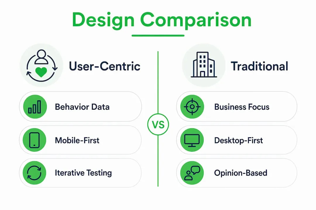
User-centric design vs traditional product page design
Traditional product page design starts with what the business wants to say. User-centred design starts with what the shopper needs to know. The gap between these two starting points explains most conversion rate differences between competing stores.
Pro Tip: When auditing an existing product page, ask one question for every element: “Does this serve the shopper’s decision, or the business’s preference?” Remove anything that fails the test.
Traditional pages are built on internal assumptions, stakeholder opinions, and category conventions. They list features because the product team values them, not because shoppers ask for them. They bury policies in footers because legal teams requested it, not because shoppers look there. The result is a page that communicates at the shopper rather than with them.
User-focused product design reverses this. Personas built from real behavioural data, not demographic guesses, drive layout decisions. Mobile-tolerant designs, which are desktop pages squished for smaller screens, consistently underperform against mobile-first designs built with native mobile features from the outset. The practical difference shows up in metrics: tap targets below 44x44px cause mis-taps and frustration; accordion content blocks reduce scroll depth on mobile and keep key information accessible.
The benefits of user-centric design compound over time. A page built on behavioural data improves with each testing cycle. A page built on assumptions requires a full rebuild when conversion rates fall. For Shopify dropshippers managing large catalogues, the cost of assumption-based design multiplies across every product listing.
Best practices for product pages: implementation steps
Applying user-centred design to a live Shopify store does not require a full redesign. The highest-impact changes are structural and can be implemented incrementally.
Mobile-first layout principles:
- Set tap targets at a minimum of 44x44px for all interactive elements.
- Use accordion blocks for size guides, specifications, and FAQs to reduce scroll depth.
- Place the product title, price, star rating, and CTA above the fold on a 390px viewport.
- Make the CTA sticky so it remains visible throughout the scroll journey.
Image and visual content:
- Follow the visual stack sequence: lifestyle context first, then detail shots, scale references, and close-ups. Read more on product image sequencing to see how this applies to Shopify stores specifically.
- Use a minimum of six images per product. Ten is the ceiling before diminishing returns set in.
- Compress images without visible quality loss to protect load speed.
Copy and information architecture:
- Answer the shopper’s most likely question in the first sentence of the product description. For most categories, that question is: “Will this work for me?”
- Place price and shipping cost together. Shoppers who discover unexpected shipping costs at checkout abandon at high rates.
- Position return policy copy directly below the “Add to Cart” button, not in the footer.
Review integration:
- Select 2–3 hero reviews that address the most common purchase objection and place them near the product title. This is review merchandising, and it outperforms a generic star rating alone. For a deeper look at persuasive page elements, the principles extend well beyond reviews.
- Continue testing post-launch. Run one A/B test per month on a single variable. Accumulate learning rather than chasing large redesigns.
Pro Tip: Prioritise the above-the-fold experience on mobile above all else. Shoppers who do not see a clear image, price, and CTA within the first scroll rarely continue.
Key takeaways
User-centric product pages built on behavioural data, mobile-first design, and iterative testing consistently outperform pages built on internal assumptions and desktop conventions.
| Point | Details |
|---|---|
| Behaviour over opinion | Base every design decision on observed shopper behaviour, not stated preferences or stakeholder assumptions. |
| Mobile-first is non-negotiable | Over 57% of e-commerce sales happen on mobile; design for 390px viewports from the start, not as an afterthought. |
| Visual stack sequencing | Lead with lifestyle imagery, then detail and scale shots; 6–10 images in sequence outperform random galleries. |
| Review merchandising | Place 2–3 curated hero reviews near the product title to halve pre-purchase doubts at the critical decision point. |
| Iterative testing | Run usability tests and A/B experiments continuously post-launch; five users reveal approximately 85% of usability problems. |
The uncomfortable truth about product page design
I have reviewed hundreds of Shopify product pages over the years, and the single most common mistake is not poor design. It is the belief that design is finished at launch. Teams spend weeks perfecting a page, publish it, and then move on. Six months later, conversion rates have drifted and nobody knows why, because nobody kept testing.
The second mistake is treating mobile as a scaling problem rather than a design problem. Shrinking a desktop layout to fit a phone screen is not mobile design. It is mobile tolerance, and shoppers feel the difference immediately. Tap targets that are too small, text that requires pinching, and CTAs that disappear mid-scroll all signal to the shopper that the store was not built for them.
The emerging shift I find genuinely interesting is AI-generated product imagery. Stores using AI to produce lifestyle context shots are closing the gap between budget constraints and professional photography. The quality threshold has risen fast. Shoppers now expect lifestyle imagery as standard, not as a premium signal. Stores that cannot produce it at scale will lose ground to those that can.
The balance between business needs and user needs is real, but it is rarely as difficult as teams make it. Shoppers want to buy. Remove the friction between their intent and the checkout, and the business goals follow naturally.
— Koen
How Ecom-eye helps you build user-centric pages at scale
Applying user-centred design principles across a large product catalogue is where most Shopify dropshippers hit a wall. Writing unique descriptions, sourcing quality images, and formatting pages correctly for mobile takes time that most store owners do not have.
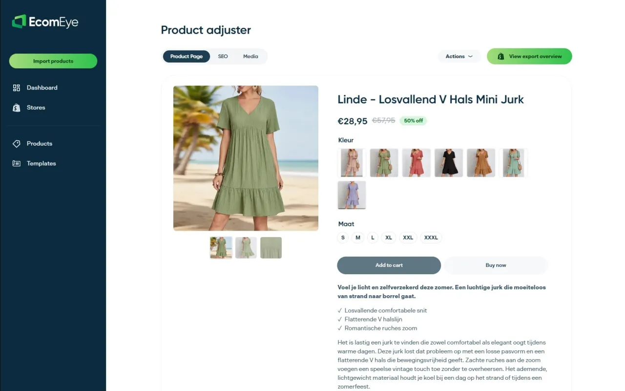
Ecom-eye automates the heaviest parts of this process. Import products in bulk from AliExpress or competitor links, and Ecom-eye generates SEO-ready titles, clean descriptions, and high-quality AI product images for every listing. Pages export directly to Shopify in one click, with no rewriting and no copyright risk. For stores managing hundreds of SKUs, this is the only practical way to maintain user experience standards across the full catalogue without a dedicated content team.
FAQ
What is a user-centric product page?
A user-centric product page is designed around observed shopper behaviour, placing key elements such as imagery, price, social proof, and CTAs where users naturally look and interact. The goal is to reduce friction between intent and purchase.
How do user-centric pages improve conversion rates?
User-centred design can boost conversion by 10–15% by aligning page layout with actual shopper behaviour, improving mobile usability, and placing trust signals such as reviews and return policies at the moments shoppers need them most.
What is the most important feature of a user-centric product page?
Mobile-first design is the single most critical feature, given that over 57% of e-commerce sales occur on mobile devices. Sticky CTAs, correct tap target sizing, and above-the-fold placement of key information are the highest-impact elements.
How often should I test my product pages?
Run at least one A/B test per month on a single variable. Five users in usability testing uncover approximately 85% of usability problems, so frequent small-scale tests are more effective than infrequent large redesigns.
Do I need a large budget to apply user-centred design?
No. Heatmap tools such as Hotjar offer free tiers, and usability testing with five real users surfaces the majority of problems. The methodology scales to any budget; the discipline of continuous testing matters more than the tools used.
Ready to boost your product pages?
Generate high-converting, SEO-optimized product pages in bulk using AI automation used by e-commerce experts.
No credit card required