2048×2048 px Shopify Product Images: Scale Without Manual Edits
Use 2048×2048 px square WebP exports at 100–500 KB. Keep one high-resolution master per SKU, fix an aspect ratio, and automate compression to speed...
2048×2048 px Shopify Product Images: Scale Without Manual Edits
Use images around 2048 × 2048 px for your product pages, square compressed to a moderate file size that balances detail and load speed. Shopify’s platform will accept files up to 5000 × 5000 px and 20 MB, but those are ceilings, not targets. Anything under 800 × 800 px is too small for zoom to work properly, and WebP should be your default format for the best balance of sharpness and load speed.
TL;DR:
- Use square images around 2048 × 2048 px for most products to balance detail, retina display compatibility, and load speed, reserving larger sizes only for high-detail categories.
- Keep image file sizes between 100–500 KB for product photos, applying compression settings around 70–80% quality to optimize load times without sacrificing visual clarity.
- Adopt WebP as the default format for its smaller size and broad compatibility, using JPEG for fallback and PNG only for transparency needs, to improve overall website performance.
- Maintain a single aspect ratio per collection and ensure all images are centered and consistently framed to avoid layout instability and enhance user trust.
- Automate image processing workflows at scale, including resizing, compression, and alt text generation, to preserve consistency across large catalogs and improve operational efficiency.
Table of Contents
- Shopify image dimensions for products: limits versus practical targets
- Recommended product image dimensions and aspect ratio rules
- Which file format works best: WebP, JPEG, PNG, or HEIC?
- Getting file sizes and compression right
- What image sizes do collection pages, heroes, and social previews need?
- How do mobile and retina displays change these numbers?
- Scaling image workflows across a large catalogue
- What actually matters most for 2026 image strategy
- EcomEye’s approach to bulk, consistent product images
- Authoritative resources to consult
- Sources
- FAQ
Shopify image dimensions for products: limits versus practical targets
Shopify’s own upload ceiling is generous: product and collection images can go as large as 5000 × 5000 px, or 25 megapixels, provided the file stays under 20 MB. That number gets quoted constantly in “Shopify image size” guides, and it’s technically correct. It’s also almost useless as a working target.
A 5000 × 5000 px JPEG straight off a DSLR can easily weigh 8 to 15 MB uncompressed. Upload a few dozen of those to a product catalogue and you’ve built a store that loads like it’s still on dial-up. Shopify will happily store the file. Your Core Web Vitals scores will not thank you for it, and neither will mobile shoppers on patchy 4G.
The gap between what the platform allows and what actually performs well is the single biggest source of confusion for merchants researching this topic. Treat the 5000 px, 20 MB figures as a technical backstop for the rare case where you genuinely need a huge master file (jewellery macro shots, print-on-demand artwork), not as guidance for everyday product photography.
Before uploading a new batch of images, run through this quick check:
- Confirm your theme’s product template doesn’t already crop or resize on the front end, which makes oversized originals pure waste.
- Check whether your theme serves responsive
srcsetvariants automatically, or whether you need to generate them yourself. - Test one sample product page in PageSpeed Insights before and after uploading a full-size original, to see the real cost in load time.
- Look at your current average product image file size in bulk (most bulk editors or apps will report this) rather than guessing.
Most stores that struggle with slow product pages aren’t hitting Shopify’s limits at all. They’re just uploading files three or four times heavier than they need to be, because nobody set a house standard.
Recommended product image dimensions and aspect ratio rules
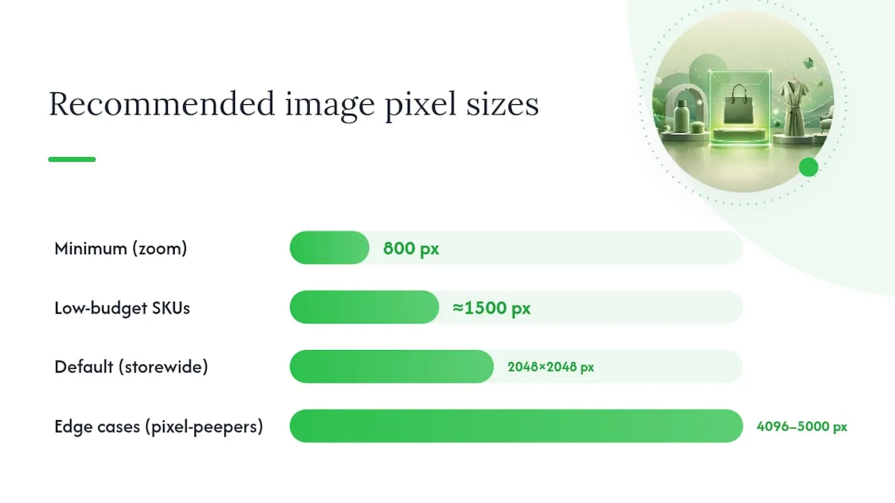
The number to build your catalogue around is 2048 × 2048 px square. Shopify’s own guidance recommends this as the sweet spot for most stores: sharp enough to survive retina displays and pinch-zoom, without dragging in the bandwidth cost of a full 5000 px master.
Here’s the logic behind that number, and where it’s worth breaking from it:
- Default to 2048 × 2048 px for standard product photography. It covers the pixel density of nearly every retina screen in circulation and gives customers enough detail to zoom in on stitching, texture, or packaging without the image turning to mush.
- Drop to around 1500 px for lower-value or fast-turnover SKUs where photography budget is tight and the product doesn’t invite close inspection, things like basic accessories or bulk consumables.
- Go up to 4096–5000 px only for categories where customers genuinely pixel-peep, such as fine jewellery, art prints, or engraved goods, where a customer zooming to inspect a hallmark or brushstroke is part of the buying decision. Cloudinary’s imaging specialists note that beyond 2048 px, most product photography sees limited perceptible benefit relative to the bandwidth cost, so reserve the larger master files for genuine edge cases.
- Never go below 800 × 800 px. Shopify’s zoom feature needs at least that resolution to activate at all, and anything smaller will look soft the moment a shopper tries to inspect it closely.
The aspect ratio question matters more than most merchants assume. Mixing landscape and portrait shots within the same collection grid creates uneven card heights, which Cloudinary flags as a genuine layout stability and trust problem rather than a cosmetic one. A grid where half the products float in whitespace and half bleed to the card edges reads as amateur, even if each individual photo is well shot.
Pick one aspect ratio per collection (square is the safe universal choice) and hold every supplier, photographer, or AI-generated image to it. If you genuinely need to mix ratios, for instance apparel shot on a model versus flat-lay accessories, segregate them into separate collections with templates built to handle the difference, rather than letting them collide in the same grid.
Pro Tip: Keep one “master” high-resolution file per product in a separate folder, even after you’ve exported the compressed storefront version. If you switch themes, launch a new marketing campaign, or need a print-quality asset later, you’ll be glad you didn’t have to re-shoot.
Which file format works best: WebP, JPEG, PNG, or HEIC?
WebP should be your default for storefront product images. Cloudinary’s benchmarking shows WebP files running 25–35% smaller than JPEG at comparable visual quality, and Google’s own developer guidance backs the same recommendation, pointing store owners toward modern formats like WebP for better load performance.
That said, format choice isn’t one-size-fits-all:
- WebP for the vast majority of product photos: smaller files, broad browser support, no visible quality trade-off at sensible compression settings.
- JPEG as a fallback for older integrations or third-party apps that don’t yet handle WebP cleanly, and for photographic images where you need universal compatibility over maximum efficiency.
- PNG only when you need true transparency, logos, line art, or flat-colour graphics where lossless edges matter more than file weight.
- HEIC files straight off an iPhone should be converted before upload. Shopify’s pipeline and most themes handle HEIC inconsistently, and it offers no advantage over WebP once converted.
Shopify runs its own imagery service behind the scenes, automatically serving the right format and size to each visitor’s browser and device where your theme supports it. That’s a genuine convenience, but it isn’t a substitute for uploading sensible source files. The service can resize a 5000 px master down for a mobile visitor, but it can’t undo bloated file weight from a badly compressed original, and it can’t fix a mismatched aspect ratio.
One caveat worth flagging: animated formats like animated WebP or GIF carry much heavier file-size penalties than static images, and Shopify’s optimisation pipeline handles them less gracefully. Use them sparingly, and never for your primary product shot.
Getting file sizes and compression right
Dimensions get most of the attention, but file weight is what actually determines load time. The targets differ by image type, and treating them all the same is a common mistake.
- Standard product images: aim for 100–500 KB after compression, even at 2048 × 2048 px.
- Hero and banner images: keep these under 600 KB where possible, since they load above the fold and directly affect Cumulative Layout Shift and perceived speed.
- Thumbnails and collection grid images: these can often sit well under 100 KB, since detail matters less at smaller display sizes.
For export settings, JPEG quality around 70 to 80% usually preserves visible detail while cutting file size substantially, paired with progressive encoding so the image renders gradually rather than in one slow block. WebP exports at a similar quality setting, using 4:2:0 chroma subsampling for photographic images, typically land in that 25 to 35% smaller range Cloudinary reports without any visible softness.
Doing this manually for a catalogue of a few hundred SKUs is tedious but doable. Batch tools inside image editors, or bulk-processing apps built for Shopify, make it realistic at scale, and pairing that workflow with technical SEO guidance like BabyLoveGrowth’s Shopify optimisation resources helps confirm the compression is actually moving your site speed scores, not just shrinking file sizes on paper. Always test before and after in PageSpeed Insights or Lighthouse rather than assuming a smaller file automatically means a faster page.
Speed and conversion are directly linked. Cloudinary’s guidance frames image optimisation as fundamentally a trade-off between visual quality and load speed, and that trade-off shows up in real purchase behaviour: slower product pages consistently correlate with higher bounce and lower conversion, which is precisely why platforms like PageSpeed treat image weight as a core performance signal rather than a cosmetic detail.
What image sizes do collection pages, heroes, and social previews need?
Product pages aren’t the only place dimensions matter. Every context on your storefront has its own practical target, and treating them all like the product-page default wastes bandwidth where it isn’t needed.
- Thumbnails: 400 to 600 px square is usually plenty, since these display small in grids and search results.
- Collection grid images: match your product-page aspect ratio (square, ideally) at around 1000 to 1500 px, since these load in bulk on one page and add up fast.
- Hero and slideshow images: typically 1800 to 2000 px wide, in a 16:9 or similar wide ratio, built with a “safe area” in the centre so text overlays don’t collide with important visual elements as the browser window resizes.
- Social and OG preview images: 1200 × 630 px is the standard most platforms expect, separate from your on-site product image entirely.
Slideshow consistency deserves a specific mention: if your homepage banner rotates through three or four images at different aspect ratios or resolutions, you’ll see visible jumping or letterboxing as slides transition. Export every slide to identical dimensions before upload.
Theme variance is the other wrinkle. Two Shopify themes given the same 2048 px source file can render it at very different display sizes depending on the grid layout and CSS. Open your live product and collection pages, right click, and inspect the actual rendered dimensions rather than assuming your theme documentation is current.
How do mobile and retina displays change these numbers?
A 2048 px source file isn’t overkill for retina screens. It’s roughly the right ceiling. Most modern phones and laptops render at 2x or 3x pixel density, meaning a “standard” 1024 px display width actually needs a 2048 or 3072 px source to look genuinely sharp rather than slightly soft. That’s the core reason Shopify’s recommendation lands where it does.
Responsive image variants, generated automatically by most modern themes through srcset, handle the rest: serving a smaller crop to a phone and the fuller resolution to a desktop monitor from the same master file. You don’t need to manually create five versions of every product photo, provided your theme is configured to generate these variants and your source file is high enough resolution to derive them from.
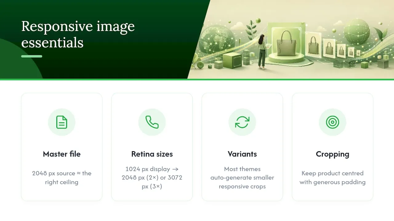
Mobile cropping is where problems often hide. A square image that looks perfectly framed on desktop can lose its subject’s edges when a mobile theme crops to a narrower thumbnail ratio. Keep your product centred with generous padding around it, rather than filling the frame edge to edge, so cropping on smaller screens doesn’t cut into the product itself.
Pro Tip: Test on an actual phone with network throttling switched on in Chrome DevTools, not just a resized desktop browser window. A desktop preview at mobile width still loads over your office wifi; it won’t show you what a real customer experiences on 4G.
Scaling image workflows across a large catalogue
Consistency breaks down fastest at scale, not on a ten-product store where one person eyeballs every upload. The fix is deciding your standard once, in writing, and applying it mechanically rather than re-deciding it per product.
A workable house standard looks like this: 2048 × 2048 px square masters, exported to WebP at 70 to 80% quality, targeting 100 to 500 KB, with alt text generated for every file as part of the same pass rather than as an afterthought (the W3C’s accessibility guidance treats meaningful alt text as a genuine requirement, not a nice-to-have). Store that standard somewhere your whole team can reference it, whether that’s a shared doc or applied directly through CSV import fields and metafields in Shopify.
A sensible job flow for bulk imports looks like: import raw supplier or AliExpress images, normalise every file to your chosen aspect ratio, compress to your target file-size range, upload in bulk, then spot-check rendered pages on both desktop and mobile before publishing. Keep the uncompressed master files archived separately rather than re-compressing an already-compressed file when you need to regenerate a variant later.
- Set your aspect ratio and target file size as a fixed rule before importing new SKUs, not after.
- Reserve full 4096 to 5000 px masters only for categories that genuinely need them.
- Automate compression and alt-text generation wherever your catalogue exceeds a few dozen products, since manual consistency erodes fast past that point.
Tools like Ecom-eye’s bulk product image generator exist specifically for merchants who’ve hit this wall: hundreds of SKUs imported from AliExpress or competitor listings, each needing consistent framing, sizing, and metadata without a designer manually processing every file.
What actually matters most for 2026 image strategy
Merchants spend a disproportionate amount of time chasing the “perfect” pixel dimension when the real differentiator is consistency. A catalogue where every product sits at 2048 px square, on the same background, at a similar compression level, will outperform a catalogue with technically sharper individual photos that don’t match each other.
Speed matters more than most merchants credit it for. A beautifully detailed image nobody waits to load is worth less than a slightly smaller one that renders instantly on a phone in a supermarket queue.
For anyone running more than a hundred SKUs, doing this by hand stops being realistic. Automation isn’t cutting corners here. It’s the only way consistency survives contact with a catalogue that size.
— Koen
EcomEye’s approach to bulk, consistent product images
If you’re managing dozens or hundreds of SKUs, manually resizing, compressing, and writing alt text for every product photo isn’t a workflow, it’s a bottleneck. Ecom-eye’s AI product image generator exists for exactly that gap: producing high-quality, consistently sized product images in bulk, so your entire catalogue holds the same aspect ratio and quality standard without a designer touching every single file.
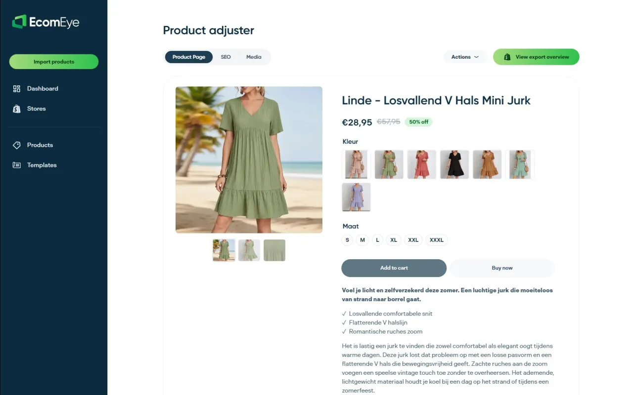
These tools are built for the situations covered above: importing product data from common dropshipping sources and needing every resulting image to match your house standard rather than whatever ratio the original supplier photo happened to use. Enforcing one aspect ratio across an entire import batch, generating alt text alongside each image rather than as a separate manual task, and exporting directly without manual file edits can be part of the workflow. If your catalogue’s images currently vary by supplier, by shoot, or by whoever uploaded them last, that inconsistency is fixable in one pass rather than one product at a time. Start with a batch import and see how quickly a mismatched catalogue turns into a uniform one.
Authoritative resources to consult
For readers who want the primary sources rather than a summary, these are worth bookmarking directly:
- Shopify’s product media documentation, covering exact upload limits and supported file types.
- Shopify’s own image size guidelines, with the 2048 px and 800 px recommendations explained in full.
- Cloudinary’s Shopify image sizing guide, for deeper technical detail on compression and format trade-offs.
- Google’s WebP developer documentation, for the technical case behind modern image formats.
Sources
- Website Image Size Guidelines for 2026 — Shopify blog
- Shopify image sizes — Cloudinary guide
- WebP — Google Developers
FAQ
What Size Should Shopify Product Images Be?
Aim for 2048 × 2048 px square, compressed to roughly 100–500 KB. This gives enough resolution for retina screens and zoom while keeping page load times fast.
Which Image Format Is Best for Shopify?
WebP is the best default, typically producing files 25–35% smaller than JPEG at similar visual quality. Keep JPEG as a fallback and reserve PNG for images needing true transparency.
What Is the Recommended Size for a Shopify Slideshow Image?
Most Shopify slideshow or hero images work best at around 1800 to 2000 px wide in a 16:9 ratio, with key text and visuals kept clear of the edges. Exact rendered size still depends on your specific theme, so check the live page.
How Do I Add Product Dimensions in Shopify?
Product image dimensions aren’t set through a separate settings field; they’re determined by the file you upload, so resize and compress the image to your target dimensions (2048 × 2048 px is the standard recommendation) before adding it to the product page.
Do I Need Different Image Sizes for Mobile?
Not manually. Most Shopify themes generate responsive variants from your source file automatically, provided that source is high enough resolution, typically 2048 px, to derive smaller crops from without losing sharpness.
Ready to boost your product pages?
Generate high-converting, SEO-optimized product pages in bulk using AI automation used by e-commerce experts.
No credit card required