Top product page must-haves for higher conversions
Discover the top product page must-haves that boost conversions. Enhance buyer confidence and reduce cart abandonment with essential design elements.

Top product page must-haves for higher conversions

TL;DR:
- A high-converting product page must prioritize visuals, benefit-led copy, trust signals, and a clear call to action. Proper image sequencing, concise benefits, and strategic trust element placement significantly boost conversions. Focusing on mobile layout and testing ensures pages are optimized for every device.
A product page is the single highest-leverage point in your entire store. Get it wrong, and 20% of all purchases are abandoned because shoppers cannot find the information they need. The top product page must-haves are the features and design elements that answer buyer questions instantly, build confidence, and remove every reason not to buy. In the industry, this is called product detail page (PDP) optimisation. This article covers the essential elements proven to lift conversions, drawn from UX research and real audit data.
1. What are the top product page must-haves?
The non-negotiable elements of a high-converting product detail page fall into four categories: visuals, copy, trust signals, and user experience. Each category addresses a different stage of the buyer’s decision. Miss one, and you create a gap that sends shoppers elsewhere. The goal is a page that answers “Is this what I was looking for?” within 3 seconds of landing.

2. High-quality images and video
Shoppers spend 65% of their time on a product page examining images. That single fact tells you where to invest first. A weak image gallery kills conversion before a shopper reads a single word of copy.
The most effective gallery follows a deliberate sequence:
- Lifestyle hero shot — shows the product in real use, sets context
- Detail angles — close-ups of texture, stitching, ports, or finish
- Scale reference — the product next to a hand, a coin, or a familiar object
- User-generated content (UGC) — real customer photos in real settings
Sequencing images in this exact order increases add-to-cart rates by 20–30%. UGC alone can improve conversion 2.4x over studio photography. That is because shoppers trust other shoppers more than they trust brands. For a deeper look at image types and formats, the Ecom-eye product image guide covers every format worth using in 2026.
Pro Tip: Aim for 6–8 images per product. Fewer than five leaves shoppers with unanswered visual questions. More than ten creates decision fatigue.
3. Benefit-led product descriptions
Copy is not decoration. Benefit-led, scannable descriptions yield 15–25% higher add-to-cart rates than dense, feature-only paragraphs. Shoppers do not read product pages; they scan them. Your copy must work in three seconds or it does not work at all.
Structure your description to answer two questions immediately: “What is it?” and “Why should I buy it?” Lead with the outcome the shopper gets, not the specification. “Stays warm to -10°C” beats “400g fill power down insulation” every time.
Key copy principles for product pages:
- One-sentence hook at the top that names the product and its primary benefit
- Bullet points for features, each written as a benefit (“Waterproof zip keeps your gear dry” not “Waterproof zip”)
- Natural SEO language woven in without forcing keywords into awkward positions
- Short paragraphs of two to three sentences maximum for mobile readability
For more on writing copy that converts, the high-converting descriptions guide from Ecom-eye goes deep on structure and phrasing.
Pro Tip: Place a micro-commitment trigger directly beneath your Add to Cart button. Phrases like “Try it for 30 days” reduce perceived purchase risk more effectively than changing button colour or size.
4. Trust signals and social proof
Reviews and ratings are not optional. They are the minimum. The real question is where you place them and how you sequence them with other trust elements.
Verified ratings belong near the product title, not buried below the fold. Shoppers look for a star rating within the first few seconds. Seeing it early confirms the product is worth reading about. However, mapping buyer objections to specific page zones matters just as much as having reviews at all. Fit, quality, delivery, risk, and payment concerns each need to be addressed in the right place on the page.
Risk-reversal elements such as guarantees, return policies, and warranties perform better when placed after the shopper has spent at least 45 seconds on the page. Placing them too high signals insecurity rather than confidence.
This approach is called Objection-First Architecture: you sequence trust elements to match the order in which doubts arise, not the order that feels logical to you as a retailer. A returns policy shown before a shopper is interested in the product reads as a warning, not a reassurance.
The UGC conversion guide from Ecom-eye explains how to integrate customer photos and reviews in a way that builds trust without cluttering the page.
5. Clear and prominent calls to action
The Add to Cart button is the most important element on the page. Its placement, size, and surrounding copy determine whether a shopper acts or leaves.
- Above the fold on desktop and mobile, always
- Minimum 48px height on mobile to avoid tap errors
- High contrast colour that stands out from the page background
- Sticky behaviour on scroll so the button is always reachable
- Variant selectors directly above or below the button, never buried in a tab
Buttons lacking visual prominence cause up to a 31% reduction in click-through rates on mobile. That is not a minor issue. It means nearly one in three potential buyers cannot easily tap the most important button on your page.
Delivery and shipping information belongs within two lines of the CTA. “Free delivery over £30. Ships in 1–2 days.” placed directly beneath the button removes a major objection at the exact moment a shopper is deciding. Generative AI tools used in ecommerce copy restructuring increasingly help retailers place this kind of micro-copy in the right position automatically.
6. Mobile-first layout and thumb-zone design
Over half of all ecommerce traffic arrives on mobile. A page designed for desktop and then shrunk for mobile is not a mobile page. It is a broken desktop page.
The thumb zone is the area of a phone screen that a right-handed user can reach comfortably with one thumb. The bottom third of the screen is the easiest to tap. The top corners are the hardest. Your Add to Cart button, variant selectors, and quantity controls all belong in the thumb zone. Navigation and secondary information can sit higher.
Font size matters too. Body copy below 16px forces shoppers to pinch and zoom. That friction kills momentum. Images should load at full width with a swipe gallery, not a horizontal scroll that breaks on some devices.
7. Accurate and specific product titles
A product title is both an SEO signal and a first impression. Vague titles like “Blue Jacket” or “Wireless Earbuds Pro” tell a shopper nothing they could not guess. Specific titles like “Men’s Waterproof Hiking Jacket, Navy, Sizes S–XXL” answer three questions before the shopper reads anything else.
Titles should include the product type, a key differentiator, and where relevant, the variant. Keep them under 70 characters for Google search display. Avoid keyword stuffing; it reads as spam and damages trust. Ecom-eye generates SEO-ready product titles in bulk, which removes the manual effort of writing titles for large catalogues.
8. Delivery, returns, and payment information
Shoppers abandon carts because they cannot find delivery costs or return terms before checkout. This information belongs on the product page, not hidden in a footer link.
Place delivery estimates and costs within the first screen. Use plain language: “Free UK delivery. Returns within 30 days.” is clearer than “Subject to standard delivery terms and conditions.” Payment method icons near the CTA reduce anxiety for shoppers who want to pay by a specific method. These are not decorative; they answer a real question.
9. Variant selectors that show availability
Colour and size selectors that show out-of-stock options as greyed out, rather than hiding them, reduce frustration. A shopper who selects a size only to see “unavailable” after clicking wastes time and loses trust. Showing availability upfront sets accurate expectations.
Swatch selectors for colour outperform dropdown menus. Shoppers can see the actual colour rather than reading a name like “Slate Grey” and guessing. Where possible, change the hero image automatically when a variant is selected so the shopper always sees what they are buying.
10. How to prioritise product page improvements
Prioritising improvements in the sequence of images first, then copy, then trust elements in a focused two-week sprint can increase conversions by 15–40%. That sequence is not arbitrary. Images have the highest impact per hour of effort. Copy comes second because it compounds the visual impression. Trust elements work best once the first two layers are solid.
A practical sprint looks like this:
- Week one: Audit and replace all images using the lifestyle, detail, scale, UGC sequence
- Week one: Rewrite titles and the first paragraph of every description to lead with benefits
- Week two: Add verified reviews near the title and micro-copy beneath the CTA
- Week two: Check mobile CTA size, contrast, and sticky behaviour on real devices
Pro Tip: Start with your three highest-traffic, lowest-converting pages. Fix those first. The data you gather will tell you exactly what to fix on the rest.
The Conversion Gravity Stack is a useful mental model here. Think of your page in three layers: the visual layer grabs attention, the copy layer builds desire, and the trust layer removes doubt. Each layer must be solid before the next one can do its job.
Key takeaways
A product page that converts well answers the right questions in the right order, starting with visuals, then copy, then trust signals.
| Point | Details |
|---|---|
| Image sequence matters | Use lifestyle hero, detail, scale, then UGC to lift add-to-cart rates by up to 30%. |
| Benefit-led copy converts | Lead with outcomes, not specifications, to achieve 15–25% higher add-to-cart rates. |
| Trust placement is timing | Place risk-reversal elements after 45 seconds of engagement, not at the top of the page. |
| Mobile CTA size is non-negotiable | Buttons below 48px height reduce mobile click-through rates by up to 31%. |
| Sprint in sequence | Fix images first, then copy, then trust elements for the fastest measurable conversion gains. |
What I have learned from auditing hundreds of product pages
Most retailers I speak to focus on the wrong thing first. They want to add more reviews, tweak button colours, or install a new app. The pages that actually convert well share one quality: clarity. A shopper lands and immediately knows what the product is, who it is for, and why it is worth buying. That clarity comes from image sequencing and the first two sentences of copy, not from a badge or a countdown timer.
The most common mistake I see is placing a returns policy in the hero section. The retailer thinks it builds confidence. What it actually does is plant doubt before the shopper is even interested. Trust elements need to earn their position on the page. They work when they answer a doubt the shopper already has, not when they pre-empt a doubt the shopper has not formed yet.
The second mistake is treating mobile as an afterthought. A page that looks fine on a 27-inch monitor can be completely broken on a mid-range Android phone. Test on real devices, not just browser emulators. The thumb zone is real. Buttons in the wrong place cost you real sales.
My honest recommendation: spend one hour on your best-selling product page with a fresh pair of eyes. Ask yourself whether you could answer “What is this and why should I buy it?” in three seconds. If you cannot, fix that before anything else.
— Koen
How Ecom-eye helps you build pages that sell
Building product pages that tick every box takes time, especially at scale. Ecom-eye is built for Shopify dropshippers who need SEO-ready product pages generated in bulk, without the manual rewriting or copyright risk that comes from copying competitor listings.
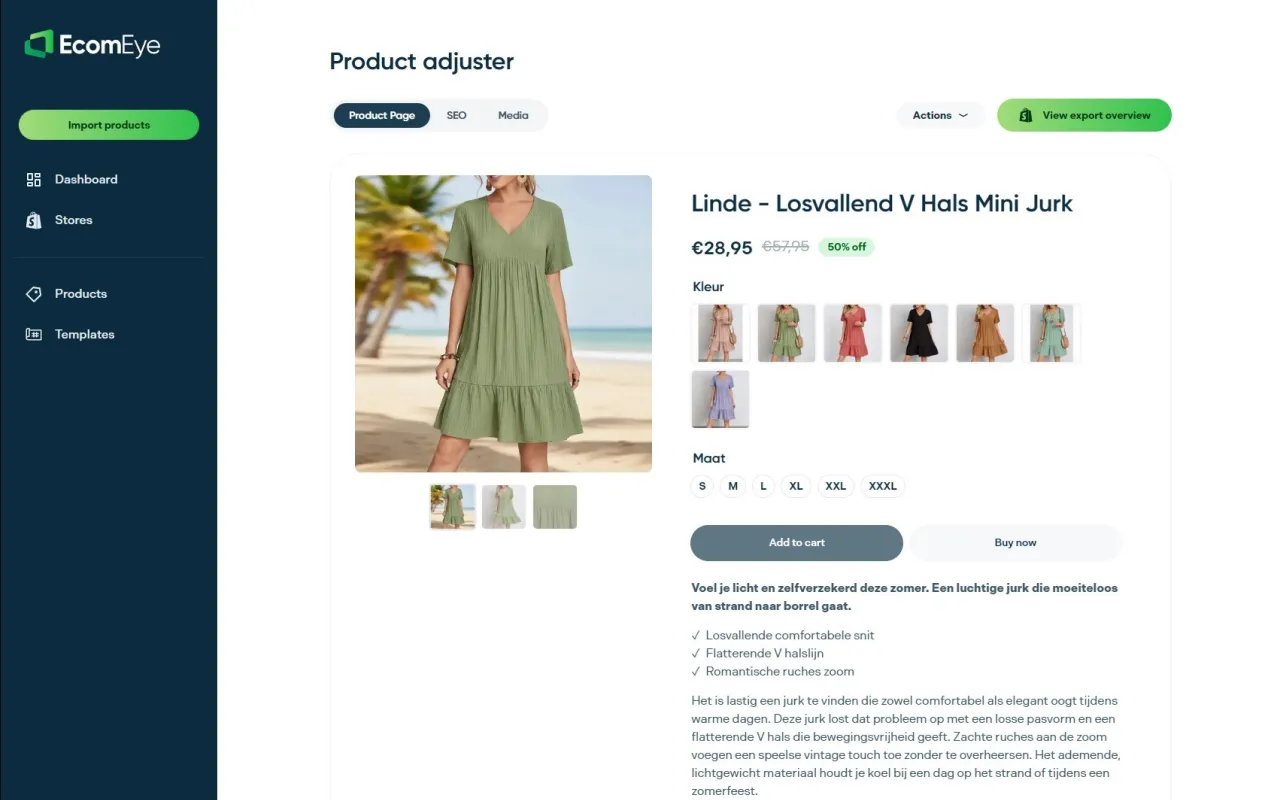
Import products from AliExpress or competitor links, and Ecom-eye automatically generates benefit-led titles, clean descriptions, and AI product images. Every page is unique, copyright-safe, and ready to export to Shopify in one click. For retailers managing hundreds of products, that is the difference between a store that ranks and one that does not.
FAQ
What are the most important elements of a product page?
The most important elements are high-quality images in the correct sequence, benefit-led copy, verified reviews near the title, and a prominent Add to Cart button above the fold. These four elements address the visual, informational, trust, and action stages of the buyer’s decision.
How many images should a product page have?
Six to eight images is the recommended range. Fewer than five leaves visual questions unanswered. The sequence should run from lifestyle hero shot through to user-generated content for maximum impact.
Where should the Add to Cart button be placed?
The Add to Cart button must appear above the fold on both desktop and mobile, with a minimum height of 48px on mobile. Sticky behaviour on scroll keeps it accessible throughout the page.
Does copy format affect conversion rates?
Benefit-led, scannable copy formatting yields 15–25% higher add-to-cart rates compared to dense, feature-only paragraphs. Short bullets written as outcomes outperform long prose descriptions on both desktop and mobile.
When should return policies appear on a product page?
Return policies and guarantees perform better when placed after the shopper has spent at least 45 seconds on the page. Showing them too early signals insecurity rather than confidence, which can increase bounce rates.
Ready to boost your product pages?
Generate high-converting, SEO-optimized product pages in bulk using AI automation used by e-commerce experts.
No credit card required