Image Aspect Ratio for Shopping: Shopify and Google Guide
Which image aspect ratio to use for Shopify and Google Shopping product photos: 1:1 vs 4:5, pixel sizes, and how to keep your whole catalogue consistent.

Image Aspect Ratio for Shopping: Shopify and Google Guide

Use 1:1 square for your main product image, at 2,048 x 2,048 px on Shopify, and give every product in the store the same ratio. Square is the shape that Shopify themes, Google Shopping and marketplaces like eBay are built around, so it is the one that gets cropped least. If you list products in bulk from supplier links, the ratio is the first thing that goes wrong, because supplier photos arrive in a mix of shapes. This guide shows what each platform wants, how to avoid cropped products and ragged grids, and how to fix the problem across a whole catalogue instead of one photo at a time.
TL;DR
- Aspect ratio is the shape of an image (width to height, such as 1:1 or 4:5). It is not the size in pixels.
- Use 1:1 for main images. Shopify says 2,048 x 2,048 px square images usually display best, and Google recommends 1,500 x 1,500 px or larger.
- Pick one ratio for the whole store. Mixed ratios are the main cause of uneven collection grids.
- Crop to the ratio before upload and keep the product fully visible. Never stretch an image to fit.
- With hundreds of supplier photos, fix the ratio once in bulk rather than editing files by hand.
Table of Contents
- Aspect ratio vs image size: the difference that trips up new stores
- Which aspect ratio works best for product images
- Shopify product image dimensions
- Google Shopping image requirements
- eBay and other marketplaces
- Why mixed ratios break your collection grid
- How to crop and resize without cutting off the product
- File size and sharpness: the part people over-do
- The dropshipper’s real problem: supplier photos in every shape
- Try it on your own catalogue
- Perspective
- FAQ
- Sources
Aspect ratio vs image size: the difference that trips up new stores
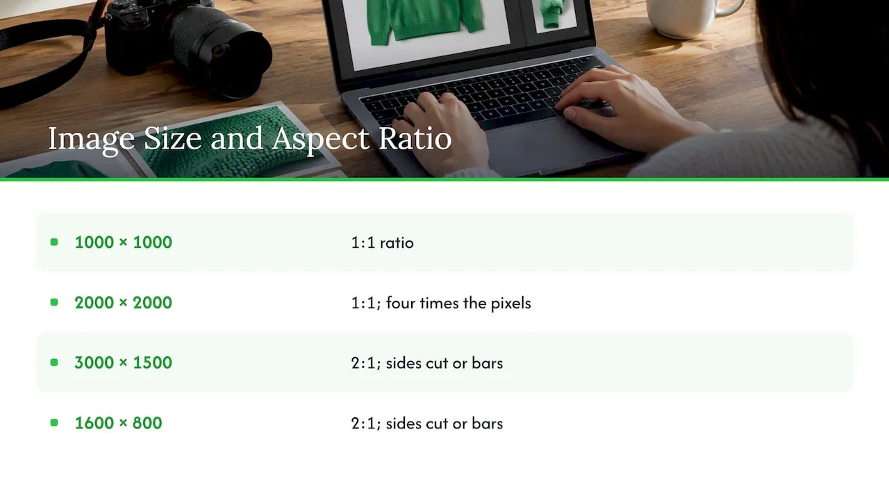
Aspect ratio is the proportion of an image’s width to its height, written as two numbers. A 1000 x 1000 photo and a 2000 x 2000 photo are both 1:1, so they share the same ratio even though one holds four times the pixels. Pixel size controls how much detail the image holds. Ratio controls its shape.
This matters because a platform that expects one shape and receives another has three options: crop it, pad it with bars, or reject it. Shopify’s own guide points out that changing the ratio changes the image’s shape but does not set how large it appears. Display size comes from the theme and the shopper’s device.
A quick example. A supplier sends a 3000 x 1500 photo and another at 1600 x 800. Different pixel counts, but both reduce to 2:1. Drop either into a square grid and the same thing happens: the sides are cut off or white bars appear above and below.
Which aspect ratio works best for product images
The short answer is square. Shopify recommends 1:1 for product listings and thumbnails because it displays well on both mobile and desktop. Most modern Shopify themes default to a square crop on collection pages, and Google Shopping and eBay both lean on square too.
Portrait ratios are a category choice, not a universal upgrade. Here is how the common shapes break down:
| Ratio | Shape | Best for | Watch out for |
|---|---|---|---|
| 1:1 | Square | Main product image, collection grids, Google Shopping, eBay | Lifestyle shots lose some context |
| 4:5 | Portrait | Apparel and on-model shots, mobile feeds, social | Gets cropped in square grids |
| 3:4 | Portrait | Fashion, trading cards | Same as above |
| 4:3 | Landscape | Shoes, electronics, furniture, phone-camera defaults | Leaves empty space in square slots |
| 16:9 | Wide | Banners and video covers | Rarely suited to product images |
The store-type guidance is consistent across the guides I checked. One Shopify app maker suggests 1:1 for general merchandise, 3:4 or 4:5 for clothing, 1:1 or 4:3 for shoes, and 4:3 or 16:9 for electronics and furniture, and advises checking how your theme renders the gallery before you commit.
If you run a general dropshipping store with mixed products, choose 1:1 and stop there. If you run an apparel-only store on a theme that supports portrait cards, 4:5 is a sensible alternative, but it has to apply to every product, not only some.
Shopify product image dimensions
Shopify is generous. Its Help Center says product images can be up to 5,000 x 5,000 px (25 megapixels) with a file size under 20 MB, and that 2,048 x 2,048 px square images usually display best. Its upload guidance adds that PNG suits graphics and transparency, while JPEG suits product images.
So the working spec for a Shopify product image is:
- Ratio: 1:1
- Size: 2,048 x 2,048 px
- Format: JPEG for photos
- Ceiling: 5,000 x 5,000 px and 20 MB
We go deeper on the pixel side in our guide to Shopify image dimensions for products. For the wider picture of what a strong product page needs, see our product image best practices for Shopify stores.
Google Shopping image requirements
If you run Google Shopping ads or free listings, the Merchant Center feed matters as much as the product page. Google’s image best-practices page recommends a main image of 1,500 x 1,500 px or larger on a clean white or light neutral background, with the product filling 75% to 90% of the frame and its whole silhouette visible.
Two more points from the same page are worth acting on:
- If an image falls below the minimum pixel requirement, upload one that is at least 500 x 500 px, and aim for 1,500 x 1,500 or larger.
- Promotional overlays such as text, watermarks, promotional claims and logos must be removed and the image re-uploaded.
That second point is where supplier photos cause trouble. Images pulled from marketplaces often carry logos or banner text, and these are a common reason for disapprovals. Also keep the composition honest: pad a non-square product with plain white rather than stretching it. A stretched image distorts the product, and letterboxing with coloured bars breaks the white-background convention.
Google treats the 75 to 90% fill and the white background as best practice rather than hard approval rules. The overlay rule is policy, so treat it as non-negotiable.
eBay and other marketplaces
Many Shopify owners also sell on marketplaces, so it helps to know that square wins there as well. eBay’s design documentation calls 1:1 its dominant and recommended ratio across listing surfaces. It keeps the original ratio of uploaded images and avoids automatic cropping, but most surfaces show 1:1, so you are expected to provide your preferred framing. Camera-phone 3:4 and 4:3 suit categories like automotive and fashion.
eBay’s seller tips set a 500 x 500 px minimum and recommend at least 1,600 x 1,600 px, with an uncluttered background, the item centred to fill the frame, and no text, artwork, logos or watermarks.
The lesson: one square master file, at 2,048 x 2,048 px, covers Shopify, Google and eBay without a second edit.
Why mixed ratios break your collection grid
The most common ratio problem has nothing to do with a platform’s rules. It is inconsistency inside your own store.
Shopify’s documentation says product images shown side by side on collection pages can be made the same size by using a consistent aspect ratio for all featured images. Themes generate different image sizes for product pages and collection templates, so when ratios differ, the cards come out at different heights.
What a mixed grid looks like in practice:
- Portrait and square images side by side produce uneven thumbnails.
- A theme that fills each slot crops the overflow, which can cut heads, feet or the edges of the product.
- A theme that fits the whole image instead adds bars, so the product looks smaller than the one next to it.
The fix is mechanical: pick one ratio and crop every featured image to match before upload. Practitioners accept that this sometimes means losing some context on lifestyle shots. It is a fair trade, because an even grid reads as a more trustworthy store. Our write-up on keeping catalogue images consistent makes the same point from the catalogue side.
How to crop and resize without cutting off the product
Here is the routine, step by step, with the place each step usually goes wrong.
1. Choose the store-wide ratio
Decide on 1:1 (or 4:5 for an apparel-only store) and write it down. Every later decision follows from it. The mistake here is deciding per product, which is how stores end up with a ragged grid.
2. Start from the largest source image
Shoot or source at the highest resolution available and crop down. Upscaling a small file adds pixels but no detail. Supplier thumbnails of 800 px will look soft on a 2,048 px square.
3. Crop with room around the product
Leave breathing space so a theme’s centre crop does not clip the product. Shopify’s own advice for reducing cropping is to adjust section settings, set a focal point, use a source image close to the image area’s ratio, or switch section or theme. The focal point setting tells the theme which part of the photo to keep.
4. Pad, never stretch
When a product is tall and narrow, extend the canvas with plain white to reach 1:1. Stretching changes the product’s proportions, which makes it look wrong and can cause trouble in feed reviews.
5. Remove overlays
Strip any logos, watermarks and promotional text before the image goes anywhere near Merchant Center.
6. Use the same master file everywhere
Publish the same file on the product page and in the feed so the two match. Then check a few products on mobile, where the crop is most visible.
Done by hand, these six steps take minutes per product. At 50 products that is a working week. For a deeper dive into pixel-level quality and file weight, see our guide on Shopify product image SEO, and for the upload limits and formats in more detail, this walkthrough on optimising images for SEO is a good companion.
File size and sharpness: the part people over-do
Bigger is not automatically better. Oversized files can slow Google’s fetch and your site, and extra megapixels do not improve Shopping rank by themselves. The goal is sharp detail at a sensible resolution, then compression. A practical target is a 2,048 px square as a JPEG with moderate compression, well within Shopify’s 20 MB cap.
Treat Google’s lowest accepted sizes as floors rather than targets. A 500 x 500 px image may pass, but it will not zoom well and will look weak beside competitors who upload 1,500 px or more.
The dropshipper’s real problem: supplier photos in every shape
A single store owner with ten products can crop by hand. A dropshipper importing from supplier links cannot. Photos from AliExpress, Amazon or Temu listings arrive in 1:1, 3:4, 4:3 and odd custom shapes, often with logos baked in. Copy them as they are and you get a ragged grid, overlay warnings in Merchant Center, and the same pictures every competitor selling the item is using.
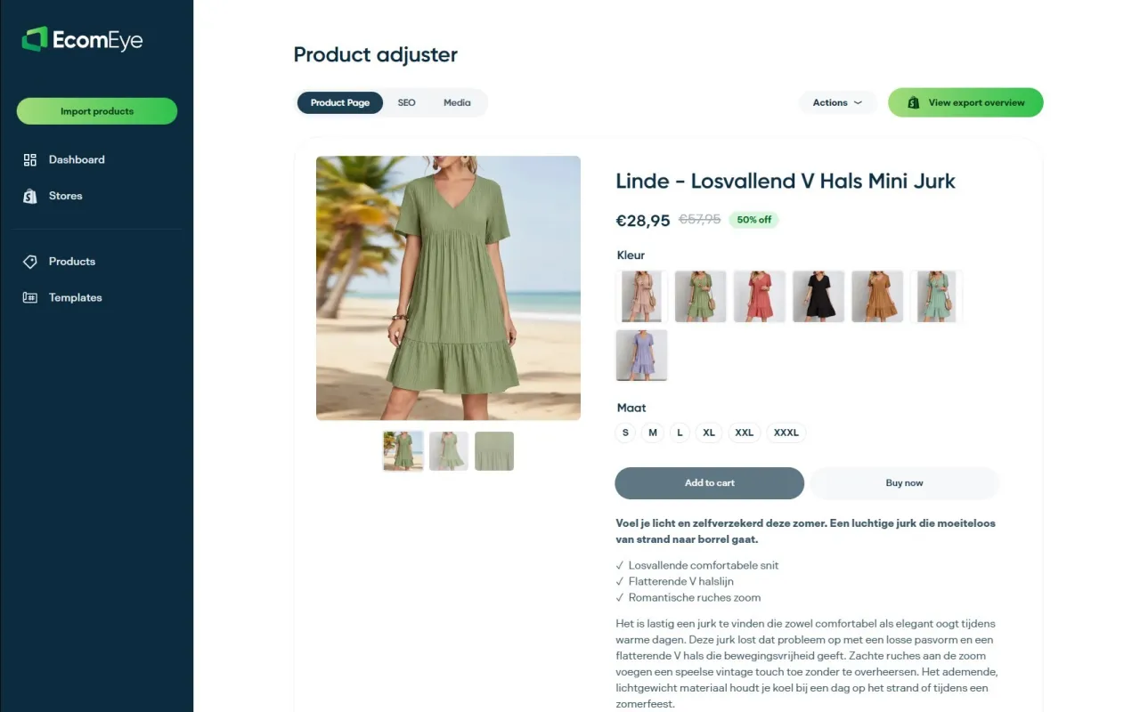
That is the situation we built Ecom-eye for. You import products in bulk from AliExpress, Amazon, Temu or competitor Shopify links, and the platform generates unique titles, descriptions and high-quality AI product images for each one, with built-in template and bulk editing, then exports to Shopify in one click. Because the images are generated for you rather than copied, you are not republishing a supplier’s file with its watermark and its odd shape. For the image types worth having on each page, see our guide to types of ecommerce product images, including lifestyle images.
Size data has the same bulk problem. If your suppliers quote centimetres and your US customers expect inches, our guides on translating product dimensions for a US store and Shopify size conversion cover it.
Try it on your own catalogue
If you are scaling a Shopify dropshipping store, our Try-out plan is €39 per month and Scaler is €99 per month, both with credits for generating product pages and images. Import a batch of products, generate the pages and images, and export to Shopify in one click. Plans are on the pricing page, and the full platform is at Ecom-eye.
Perspective
Most ratio advice is written for someone with a camera and ten products. Our customers have the opposite problem: hundreds of products, photos they did not take, and a deadline.
Our view is that ratio should be a store-wide setting, decided once, not a fix applied product by product. That is why we build around bulk. Every page and every image is generated uniquely for the user, so a listing is never a copy of a competitor’s page, and bulk editing lets you apply a template across the catalogue instead of reopening each product.
The rule we give every store owner: pick square, keep the product fully in frame, keep logos and text off the image, and use the same file on the page and in the feed. Do that across the whole catalogue and the grid, the feed and the shopper all get what they expect.
Koen
FAQ
What is the best aspect ratio for Shopify product images?
1:1 square. Shopify recommends it for listings and thumbnails, and says 2,048 x 2,048 px images usually display best. Use one ratio for every product so your collection grid stays even.
What image size does Google Shopping require?
Google recommends a main image of 1,500 x 1,500 px or larger on a clean white or light neutral background. If an image is below the minimum, upload one of at least 500 x 500 px, and remove any logos, watermarks or promotional text.
Can I mix square and portrait photos in one store?
You can, but it is the most common cause of uneven collection pages. Shopify advises using a consistent aspect ratio for featured images so side-by-side products display at the same size. Choose square, or portrait for an apparel-only store, and apply it everywhere.
What is a 2:3 aspect ratio?
It means the image is two units wide for every three tall, the standard of 35mm photos and 4 x 6 prints. It is a portrait shape. Crop it to 1:1 for the main product image, or to 4:5 if your theme and store type suit portrait cards.
Does aspect ratio affect file size?
Not significantly. Ratio changes the shape of an image, while pixel dimensions and compression drive file size. Aim for a 2,048 px square JPEG, well under Shopify’s 20 MB limit.
Sources
- What Is Aspect Ratio? Instasize glossary
- Aspect ratios, StoreConnect support
- Image Aspect Ratio Guide, Shopify blog
- Product media types, Shopify Help Center
- Uploading images, Shopify Help Center
- Image best practices, Google Merchant Center Help
- Image Ratio, eBay Playbook
- Take great photos, eBay Seller Center
- Shopify Product Image Size guide, Gigilabs
- Optimising images for SEO
- Product catalogue consistency