Product pages that convert: a guide for UK stores
Unlock higher conversion rates with these six essential fixes for your product pages. Transform visitors into buyers quickly today!

Product pages that convert: a guide for UK stores

A product page, or product detail page (PDP), has one job: persuade a single visitor to buy a specific item. Before anything else, run through these six fixes. They move the needle faster than anything else you can do this week.
Six priority fixes to action in the next 24–72 hours:
- Images with scale — show the product next to a human or a familiar object; Baymard research shows that many shoppers rely on imagery to estimate size
- Price and VAT clarity — display the price inclusive of VAT for UK consumers, with any delivery cost visible before checkout
- Prominent CTA — one clear “Add to basket” button above the fold, high-contrast, impossible to miss
- Stock status — tell the shopper whether the item is in stock, low stock, or available for pre-order
- Social proof — a star rating and review count near the title, not buried at the bottom
- Page speed on mobile — if your page loads in more than three seconds, a significant share of visitors leave before they see the product
A product page is fit for purpose when a visitor can answer three questions in under ten seconds: what is it, how much does it cost, and why should I trust this seller? If your page fails any of those, the rest of this guide will tell you exactly what to fix.
Key takeaways
A high-converting product page combines clear pricing, scale-accurate imagery, a prominent CTA, and social proof placed near the point of decision, with Product schema and mobile-first performance underpinning everything.
| Point | Details |
|---|---|
| Six priority fixes | Images with scale, VAT-inclusive price, prominent CTA, stock status, social proof, and mobile speed are the highest-impact changes. |
| 42% rely on images for size | Baymard research shows nearly half of shoppers use imagery to estimate size; always include a scale reference. |
| Trust cluster near CTA | Group star rating, delivery estimate, and returns policy within 200px of the “Add to basket” button. |
| Test RPV, not just conversion rate | Revenue per visitor is more sensitive to price and cross-sell changes than conversion rate alone. |
| Ecom-eye for scale | Ecom-eye generates bulk, copyright-safe, SEO-ready Shopify product pages with AI images, removing the manual bottleneck for growing catalogues. |
Table of Contents
- What does a product page need to include?
- Design and copy tactics that improve conversion rates
- Five annotated product-page examples with ideas to copy
- SEO and technical checklist for UK product pages
- How to write product descriptions that actually convert
- How to use reviews and trust signals effectively
- What to test on product pages and which metrics matter
- A product-page audit you can run in ten minutes
- Accessibility on product pages: what UK stores need to get right
- Personalisation on product pages: what actually works
- The mistakes that actually cost stores money
- Publishing hundreds of optimised product pages without the manual work
- Sources
- FAQ
What does a product page need to include?
Shopify defines the PDP as a persuasion page built to close a sale on a single SKU, distinct from a product listing page (PLP) designed for browsing. That distinction matters for how you structure every element below.
The canonical elements, in order of page hierarchy:
- Product title — descriptive, keyword-rich, and specific (include size, colour, and material where relevant)
- Hero image gallery — minimum five images: hero shot, multiple angles, lifestyle/context, scale reference, and variant-linked images that update when a shopper selects a colour or size
- Price — displayed inclusive of VAT for UK stores, with any “was/now” pricing clearly labelled to comply with the Omnibus Directive
- Variant selectors — size, colour, or configuration options with clear labels; out-of-stock variants greyed out rather than hidden
- Add to basket CTA — single, prominent, above the fold on desktop and pinned (sticky) on mobile
- Availability and delivery estimate — “In stock, dispatched within 1–2 working days” outperforms vague “ships soon” language
- Short benefit summary — three to five bullet points above the fold covering the key reasons to buy
- Full product description and specs — below the fold, scannable, with a size guide linked where relevant
- Reviews and ratings — summary score near the title; full review list lower on the page
- Shipping, returns and payment information — UK Distance Selling Regulations require clear pre-purchase disclosure of returns rights; place this near the CTA, not only in the footer
UK-specific notes: UK consumers expect prices inclusive of VAT by default. If you sell B2B and display ex-VAT pricing, label it explicitly. Returns policy wording should reference the 14-day cooling-off period under the Consumer Contracts Regulations 2013.
Baymard’s research flags that A significant share of ecommerce sites bury value propositions like free shipping in site-wide banners that users ignore. Place those propositions directly beneath the price or alongside the CTA instead.
Pro Tip: Nielsen Norman Group recommends treating the PDP as a ‘workhorse’ and classifying features as must-have, nice-to-have, or ‘fancy’. Add interactive features only when they fill a genuine information gap, not because they look impressive. A 360° spin viewer that takes three seconds to load is worse than a clean five-image gallery.
Design and copy tactics that improve conversion rates
Layout and copy are not separate disciplines on a product page. The way information is arranged determines whether the copy gets read at all.
Principles that hold across every category:
- Mobile-first layout: design for a 390px viewport and scale up, not the reverse
- Visual hierarchy: the eye should land on the hero image, then the title, then the price, then the CTA, in that order
- High contrast for the CTA button: the “Add to basket” button should stand out from the background without relying on colour alone (important for accessibility)
- Scannability: use short paragraphs, bullet points for specs, and bold labels for key attributes
Copy approach:
Lead every description with the benefit, not the feature. “Stays warm to −10°C” beats “400g fill power down.” Follow the benefit with the proof or spec, then a micro-CTA or reassurance line (“Free returns within 30 days”).
Avoid marketing fluff. Phrases like “premium quality” and “best in class” carry no information. Replace them with specifics: materials, certifications, dimensions, or test results.
Image rules:
- Hero shot on a clean background, product centred
- Multiple angles (back, side, detail close-up)
- Lifestyle or context shot showing the product in use
- Scale reference image with a human model or a common object
- Variant-linked images that swap automatically when a shopper selects a different colour or size
For product image best practices specific to Shopify stores, including responsive image handling and file-size targets, the guidance is worth bookmarking before you next update your image set.
Three A/B tests to run next week:
- CTA copy — test “Add to basket” vs. “Buy now” vs. a benefit-led variant like “Get yours today”; measure add-to-cart rate
- Hero image type — test a clean product shot vs. a lifestyle image as the first image in the gallery; measure time on page and conversion rate
- Price presentation — test showing the monthly instalment option (Klarna, Clearpay) alongside the full price vs. full price only; measure revenue per visitor
Pro Tip: Microcopy is where most stores leave money on the table. “Only 3 left” outperforms “Low stock.” “Added to your basket” with a mini-cart preview prevents duplicate adds. An error message that says “Please select a size before adding” is more helpful than a generic red outline. Write every state — default, hover, error, success — before you launch.
Five annotated product-page examples with ideas to copy
These examples are chosen for the specific conversion principle each one demonstrates, not for general praise. Take the pattern; adapt it to your store.
Allbirds: benefit-led above-the-fold copy
Allbirds leads with the environmental and comfort benefit before the technical spec. The headline on a shoe PDP reads more like “Naturally comfortable, naturally responsible” than a product code. Below that, a tight bullet list covers the key materials claim, the washability, and the carbon footprint figure.
What to copy: Write your above-the-fold bullet list as benefit statements first, spec second. “Merino wool upper — naturally temperature-regulating” beats “Merino wool upper.”
Experiment: Test a version where the first bullet leads with the most common objection (“Machine washable — yes, really”) against your current copy. Track add-to-cart rate.
Lush: sensory copy and UGC integration
Lush product pages are heavy on sensory language (“smells like a freshly squeezed lemon,” “melts into skin”) and integrate customer photos directly into the gallery. The effect is that the page reads like a recommendation from a friend rather than a catalogue entry.
What to copy: Identify the one sensory or emotional experience your product delivers and lead the description with it. Integrate customer photos into the image gallery, labelled as “Customer photos” for transparency.
Experiment: Add three to five customer photos to the image gallery and measure whether return rate drops (a proxy for expectation-setting accuracy).
Bellroy: the size and fit problem solved with video
Bellroy uses short, looping video clips inside the image gallery to show wallet capacity and how cards slot in. This addresses the single biggest pre-purchase anxiety for a slim wallet buyer: will my cards actually fit?

What to copy: Identify the one question your reviews show buyers ask most before purchasing. Answer it with a ten-second video clip in the image gallery, not in a FAQ buried below the fold.
Experiment: Add a looping product-use video as the second image in the gallery. Measure whether “What fits inside?” support tickets decrease and whether conversion rate improves.
ASOS: size guide integration and variant clarity
ASOS links a detailed size guide directly from the size selector, opens it in a modal (so the shopper never leaves the PDP), and shows which sizes are low in stock inline. Out-of-stock sizes are greyed out with a “notify me” option rather than removed.
What to copy: Link your size guide from the variant selector, not from a footer link. Keep out-of-stock variants visible with a “notify me” option to capture demand data and recover future sales.
Experiment: Test a modal size guide (opens on the same page) vs. a new-tab size guide. Measure drop-off rate from the PDP.
A generic high-converting pattern: the trust cluster
Drip’s product-page checklist identifies a pattern that appears across the best-converting pages: a “trust cluster” grouped near the CTA. This typically includes a star rating, a delivery estimate, a returns reassurance line, and accepted payment icons, all within 200px of the “Add to basket” button.
What to copy: Group your star rating, delivery promise, and returns policy into a compact block directly beneath or beside the CTA. Do not scatter these across the page.
Experiment: Move your returns policy from the footer to the trust cluster beneath the CTA. Measure conversion rate and, if possible, chat support volume about returns.
SEO and technical checklist for UK product pages
A well-designed product page that Google cannot index or understand is invisible. The technical layer matters as much as the copy.
Structured data (Product schema) — fields to include:
| Schema field | Where it appears on the page | Why it matters |
|---|---|---|
name |
Product title (H1) | Core identifier for rich results |
image |
Hero image URL(s) | Enables image rich results |
description |
Meta description / body copy | Contextual relevance signal |
sku |
Variant or product code | Deduplication and merchant feeds |
brand |
Brand name near title | Brand entity association |
offers.price |
Displayed price | Price rich result eligibility |
offers.priceCurrency |
GBP for UK stores | Currency accuracy in SERPs |
offers.availability |
Stock status | “In stock” label in results |
aggregateRating |
Star rating near title | Star snippet in organic results |
gtin / mpn |
Product specifications | Google Merchant Centre matching |
Metadata and canonical guidance:
- Write unique title tags for every PDP:
[Product Name] | [Brand] | [Category]works well and stays under 60 characters - Meta descriptions should include the key benefit and a call to action; 150–155 characters
- Set a canonical tag on every PDP to prevent duplicate content from faceted navigation or URL parameters
- For multi-currency or multi-language setups, use
hreflangtags to signal the correct regional version; UK English pages should carryhreflang="en-GB"
Image optimisation:
- Serve images in WebP format with JPEG fallback
- Use descriptive filenames:
bellroy-slim-wallet-black-front.webpnotIMG_4521.webp - Include descriptive
alttext for every image (also an accessibility requirement) - Use
srcsetandsizesattributes for responsive delivery - Lazy-load images below the fold; never lazy-load the hero image
Page speed priorities:
- Eliminate render-blocking scripts above the fold
- Use a CDN for image and asset delivery
- Target a Largest Contentful Paint (LCP) under 2.5 seconds on mobile
- Compress CSS and JavaScript; defer non-critical scripts
UK legal notes: UK consumer law requires prices to be displayed inclusive of VAT for retail customers. The Omnibus Directive (implemented in the UK as the Digital Markets, Competition and Consumers Act 2024) requires that any “was” price reflects the lowest price in the preceding 30 days. Display this accurately or remove the comparison pricing.
Baymard’s research also notes that Many stores miss either a site-authored FAQ or a community Q&A section on PDPs, both of which reduce support load and improve buyer confidence when present.
Pro Tip: Run your PDP URL through Google’s Rich Results Test after adding Product schema. A schema error on price or availability will disqualify the page from price-rich results in Google Shopping, which is a significant traffic source for UK stores.
How to write product descriptions that actually convert
Most product descriptions fail for one reason: they describe the product to someone who already owns it, not to someone deciding whether to buy it.
The core copy formula:
- Lead with the benefit — what does the product do for the buyer’s life?
- Prove it with a spec or credential — material, certification, test result, or measurement
- Handle the objection — address the most common hesitation in one line
- Close with a micro-CTA or reassurance — “Free returns within 30 days” or “In stock, dispatched today”
Before and after:
Before: “This jacket features a 400g fill power down insulation and a DWR-coated nylon shell with a YKK zip.”
After: “Stays genuinely warm to −10°C, thanks to 400g fill power down and a DWR-coated shell that sheds light rain. The YKK zip won’t snag. Free returns if the fit isn’t right.”
The second version answers “will I be warm enough?” before the shopper has to ask.
Microcopy snippets to adapt:
- Stock: “Only 4 left at this price” (specific beats vague)
- Delivery: “Order before 2PM for next-day delivery to most UK postcodes”
- Size: “Fits true to size — our model is 5’10” wearing a Medium"
- Add-to-cart feedback: “Added! View basket or keep shopping.”
- Size guidance link: “Not sure of your size? Our size guide takes 30 seconds.”
For SEO: Place the primary keyword phrase naturally in the first 100 words of the description, in the H1 title, and in the meta description. For a high-converting product description that also ranks, the keyword should appear in the product title, one H2 subheading (if the description is long enough to warrant one), and the first paragraph. Do not repeat it mechanically; use natural variants and related terms throughout.
Adobe’s guidance reinforces that accurate shipping information and immediate add-to-cart feedback are among the most effective tools for reducing abandonment at the PDP stage.
How to use reviews and trust signals effectively
Social proof is not decoration. Placed correctly, it removes the last objection standing between a visitor and the “Add to basket” button.
Placement guide:
- Summary rating (stars + count) — immediately below the product title, before the price
- Highlighted review snippet — one or two sentences from a real review, placed near the CTA or beneath the price; pick a review that addresses the most common objection
- Full review list — below the fold, after the product description
- UGC photo gallery — integrated into the main image gallery or as a separate section below the description, labelled clearly as customer photos
- Trust badges — near the CTA: accepted payment methods, security certification, delivery partner logos
Trust signals that carry weight with UK shoppers:
- Verified purchase labels on reviews (Trustpilot, Google Reviews, or platform-native)
- Delivery partner badge (Royal Mail, DPD, Evri) with a specific delivery estimate
- “Secure checkout” badge near payment icons
- Returns policy summary (not just a link — write the key point: “Free returns within 30 days”)
For a deeper look at product page trust signals and how to structure badge placement, the guide covers verified-purchase labelling and accessibility tagging for review sections.
For SEO and accessibility: Mark up your review section with Review and AggregateRating schema. Use aria-label attributes on star-rating icons so screen readers can announce “4.7 out of 5 stars, 312 reviews” rather than reading five empty star characters.
Pro Tip: The most credible UGC is unfiltered. Show reviews that mention a minor drawback alongside the positive ones. A page with 200 five-star reviews and zero criticism reads as curated and reduces trust. A 4.6 average with honest mixed reviews converts better than a suspiciously perfect score.
What to test on product pages and which metrics matter
Testing without a hypothesis is just changing things and hoping. Start with the highest-traffic, highest-impact elements.
A/B test priority list:
- CTA button copy and colour — hypothesis: a benefit-led label (“Get yours today”) outperforms a generic one (“Add to basket”); metric: add-to-cart rate
- Hero image type — hypothesis: a lifestyle image as the first image increases time on page and conversion vs. a plain product shot; metric: conversion rate and bounce rate
- Price presentation — hypothesis: showing a monthly instalment option alongside the full price increases conversion for items over £50; metric: revenue per visitor (RPV)
- Urgency cue — hypothesis: “Only 3 left” near the CTA increases conversion vs. no stock message; metric: conversion rate (watch for trust impact in post-purchase surveys)
- Cross-sell placement — hypothesis: “Frequently bought together” placed below the CTA converts better than in a sidebar; metric: average order value
Metrics to track for every test:
- Conversion rate (primary)
- Revenue per visitor (RPV) — more sensitive than conversion rate alone
- Add-to-cart rate (leading indicator)
- Bounce rate on the PDP
- Mobile vs. desktop split (run separate analyses; mobile behaviour differs significantly)
Tool suggestions: Google Optimize has been sunset; current options include VWO, AB Tasty, and Optimizely for A/B testing. For heatmaps and session recordings, Hotjar and Microsoft Clarity (free) are both widely used. Google Analytics 4 handles conversion tracking and RPV reporting natively.
When traffic volumes are low, focus on high-impact copy and image changes before running concurrent A/B tests. Drip’s guidance recommends sequential testing and tracking RPV as the primary business-impact metric. A test needs sufficient sample size to reach statistical significance; running it for too short a period on low-traffic pages produces noise, not insight.
Do not stop early because one variant looks better after three days.
A product-page audit you can run in ten minutes
Score each checkpoint 0 (missing), 1 (partial), or 2 (done well). A total score of 14 or above is a solid baseline; below 10 means conversion is being left on the table.
| Checkpoint | What to check | Quick fix if failing |
|---|---|---|
| Hero image quality | Sharp, well-lit, clean background, high resolution | Reshoot or use AI-generated images; compress to WebP |
| Scale reference | At least one image with a human or object for scale | Add a lifestyle shot or annotate an image with dimensions |
| Price and VAT | Price shown inc. VAT, clearly visible above the fold | Update template to show VAT-inclusive price by default |
| CTA prominence | “Add to basket” button above the fold, high contrast | Increase button size and contrast; test sticky CTA on mobile |
| Stock status | Clear in-stock / low-stock / out-of-stock message | Add stock-level display to PDP template |
| Mobile layout | Page usable on a 390px viewport; CTA reachable by thumb | Enable sticky CTA; reduce image file sizes |
| Product schema | Valid Product schema with price, availability, rating | Add or fix schema using Google’s Rich Results Test |
| Reviews visible | Star rating near title; at least one review visible above fold | Move rating widget to below the product title |
| Shipping clarity | Delivery estimate and cost visible before checkout | Add delivery estimate block near CTA |
| Returns policy | 14-day return right referenced near CTA or in trust cluster | Add one-line returns summary beneath the CTA button |
For a full product page must-haves checklist you can copy into a spreadsheet and reuse across your catalogue, the Ecom-eye blog version includes scoring weights by traffic volume.
Accessibility on product pages: what UK stores need to get right
Accessibility is not optional for UK stores. The Equality Act 2010 covers digital services, and an inaccessible product page excludes a significant share of potential customers.
Screen reader compatibility:
- Every image must have descriptive
alttext. “Black leather wallet, front view” is useful; “image1.jpg” is not. - Star ratings rendered as icon fonts or SVGs need an
aria-labelthat states the numeric value:aria-label="4.7 out of 5 stars". - Variant selectors (colour swatches, size buttons) must be keyboard-navigable and announce their current state to screen readers using
aria-pressedoraria-selected. - The “Add to basket” button must be a real
<button>element, not a styled<div>. Screen readers and keyboard users depend on native button semantics.
Keyboard navigation:
- Every interactive element (image zoom, size guide modal, review accordion) must be reachable and operable using the Tab key alone.
- Modals (size guides, quick-view panels) must trap focus while open and return focus to the trigger element when closed.
- Avoid hover-only interactions; any information revealed on hover must also be accessible on focus.
Colour and contrast:
- CTA button text must meet WCAG 2.1 AA contrast ratio of at least 4.5:1 against the button background.
- Do not rely on colour alone to communicate variant availability (e.g. a red swatch for out-of-stock). Add a strikethrough or a text label.
Testing with a screen reader (NVDA on Windows, VoiceOver on macOS and iOS) takes under 30 minutes per page and will surface the most critical issues faster than any automated tool alone.
Personalisation on product pages: what actually works
Personalisation on a product page means showing different content to different visitors based on what you know about them. Done well, it reduces friction. Done poorly, it adds complexity without measurable benefit.
Practical techniques by data signal:
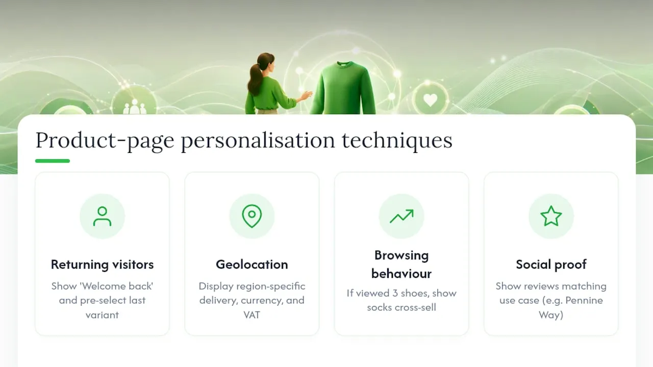
Returning visitor recognition: Show “Welcome back” messaging with the last-viewed variant pre-selected. If a visitor viewed a blue version of a product on a previous session, open the page on blue by default. This reduces the number of clicks to purchase for a returning buyer.
Geolocation-based content: Display delivery estimates specific to the visitor’s region. “Next-day delivery to London postcodes” is more compelling than a generic estimate. For UK stores with EU traffic, show the correct currency and VAT treatment automatically.
Browsing behaviour signals: If a visitor has viewed three running shoes in the past 30 minutes, surface the “frequently bought together” cross-sell with running socks rather than a generic recommendation. Behavioural signals make cross-sells feel relevant rather than algorithmic.
Dynamic social proof: Show review snippets that match the visitor’s inferred use case. A visitor arriving from a search for “waterproof jacket for hiking” should see the review that mentions “kept me dry on the Pennine Way,” not a review about office commuting.
Generative AI tools are increasingly used to power this kind of dynamic content at scale, generating variant-specific copy and personalised recommendation logic without manual intervention for each segment.
What to avoid: Personalisation that feels intrusive (“We noticed you looked at this yesterday”) tends to reduce trust rather than build it. Stick to personalisation that makes the page more useful, not personalisation that demonstrates how much data you hold.
For stores using Shopify, apps like LimeSpot, Rebuy, and Nosto offer out-of-the-box personalisation for product recommendations and dynamic content blocks without custom development.
The mistakes that actually cost stores money
Most product-page advice focuses on what to add. The more useful question is what is actively costing you sales right now.
Mistake 1: Using supplier copy verbatim. Supplier descriptions are written for a catalogue, not for a buyer with a specific problem. They describe features, not benefits, and they appear on dozens of other stores, which creates duplicate-content issues that suppress Google rankings. Rewrite every description in your own voice, leading with the benefit.
Mistake 2: Missing scale references. Baymard’s finding that 42% of shoppers use images to estimate size is not a minor UX note. It is a returns-reduction lever. A single image showing the product held in a hand or next to a ruler can materially reduce “it was smaller than I expected” returns.
Mistake 3: Hiding shipping costs until checkout. UK shoppers expect to see the full cost before they commit. A product page that shows £29.99 and then adds £4.99 at checkout creates a trust gap. Display the delivery cost, or the free-delivery threshold, directly on the PDP.
Mistake 4: Treating mobile as an afterthought. More than half of UK ecommerce traffic arrives on mobile. A page designed for desktop and then “made responsive” is not the same as a page designed mobile-first. Test your PDP on a real device, not just a browser emulator.
Mistake 5: Launching without schema. Product schema takes an hour to implement correctly and unlocks price, availability, and rating rich results in Google. Stores that skip it are invisible in the features that drive the highest click-through rates from organic search.
Quick wins with the fastest return: add a scale reference image (30 minutes), move the returns policy to the trust cluster near the CTA (15 minutes), and add Product schema if it is missing (60 minutes with a Shopify app or JSON-LD snippet). Those three changes address the most common conversion blockers without a redesign.
Publishing hundreds of optimised product pages without the manual work
Scaling a Shopify dropshipping store means publishing product pages faster than a team can write them. The bottleneck is almost always content: unique titles, descriptions, and images that do not copy competitors and do not trigger Google Merchant Centre disapprovals.
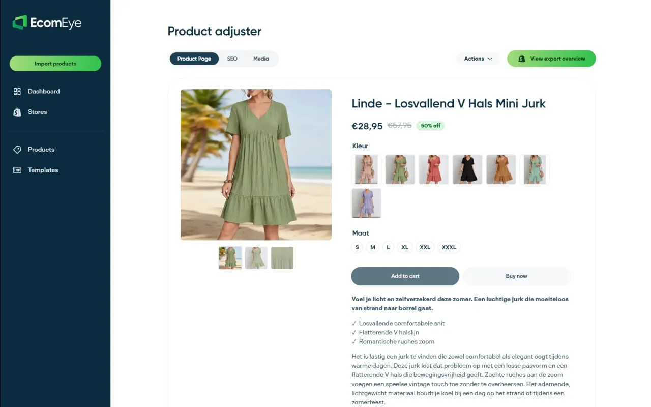
Ecom-eye generates bulk, copyright-safe, SEO-ready product pages from AliExpress, Amazon, Temu, or competitor Shopify links. Import a product list, and the platform produces unique titles, clean benefit-led descriptions, and high-quality AI product images, then exports directly to Shopify in one click. Multi-language pages are included, which matters for UK stores targeting EU markets or running separate regional storefronts. There is no rewriting, no copyright risk, and no manual work per SKU.
For stores expanding their catalogue or launching a new dropshipping vertical, bulk content generation is the difference between publishing 500 pages in a week and publishing 500 pages in three months. The SEO benefit compounds: unique content across a large catalogue builds topical authority faster than a handful of well-crafted pages on a thin site.
Start with a free trial at Ecom-eye to generate your first batch of product pages and see the output quality before committing to a subscription.
Sources
The following sources informed this guide and are worth reading in full for deeper technical and UX detail.
- UX Guidelines for Ecommerce Product Pages - NN/g
- 1573 ‘Product Page’ Design Examples – Baymard Institute
- What Is PDP in Ecommerce? Product Detail Page Guide (2025) - Shopify
- 13 Best Product Page Examples + 2026 Checklist
- Product detail pages — what they are, why they’re important, and how to optimise yours
FAQ
What is a product page?
A product page, or product detail page (PDP), is a dedicated ecommerce page built to persuade a visitor to purchase a single specific item. It differs from a product listing page, which is designed for browsing multiple products.
What should be on a product page?
A product page should include a descriptive title, a gallery of high-quality images (with a scale reference), a VAT-inclusive price, variant selectors, a prominent “Add to basket” CTA, stock status, a short benefit summary, full specifications, customer reviews, and clear shipping and returns information.
How do you make a product page that converts?
Lead with the benefit in your copy, place social proof near the CTA, show a scale reference image, display shipping costs and returns policy before checkout, and add Product schema for rich results. Test CTA copy, hero image type, and price presentation to find what moves revenue per visitor.
What is the difference between a product page and a landing page?
A product page is a permanent catalogue page built around a single SKU, optimised for both organic search and conversion. A landing page is typically a temporary, campaign-specific page with no navigation, built to convert traffic from a single paid or promotional source. Shopify’s guidance describes the PDP as a persuasion page for a single product, while landing pages are usually stripped of everything except the conversion goal.
How can I create product pages at scale without duplicate content?
Use a tool like Ecom-eye to generate unique, SEO-ready titles and descriptions in bulk from product data, avoiding the duplicate-content issues that arise from copying supplier copy or competitor pages. Each generated page is copyright-safe and ready to export directly to Shopify.
Ready to boost your product pages?
Generate high-converting, SEO-optimized product pages in bulk using AI automation used by e-commerce experts.
No credit card required